No Hidden Pencils in Hidden Figures

Just a brief post about something I haven’t seen in the press – pencils play a major role in the film Hidden Figures.

Still from Hidden Figures

In particular, mathematician Katherine Johnson (Taraji P. Henson) uses a Pentel P20X mechanical pencil in contrast to the other engineers, who use yellow woodcase pencils. A more evolved pencil for a more evolved person? As some of the management become just a little more enlightened, you observe that they also start to use mechanical pencils.

When Mary Jackson (Janelle Monáe) decides to become an engineer and wonders about her husband’s support, he gives her a clutch leadholder as a gift.

Still from Hidden Figures

And chalkboards! So high they require library step ladders to reach the top. Giant chalkboards for giant problems.

A woman with the right pencil can’t be stopped!

The Viarco Vintage Collection

From Viarco of Portugal, pencil talk is pleased to present an amazing new limited edition pencil collection. Further, we are privileged to feature an interview with Viarco’s José Vieira.

Viarco Vintage Collection

The set was a surprise to me – six historical recreations of pencils and packaging, offered as a set. I’m not sure where the set is being offered – I found it at a US retailer, but not on Viarco’s website.

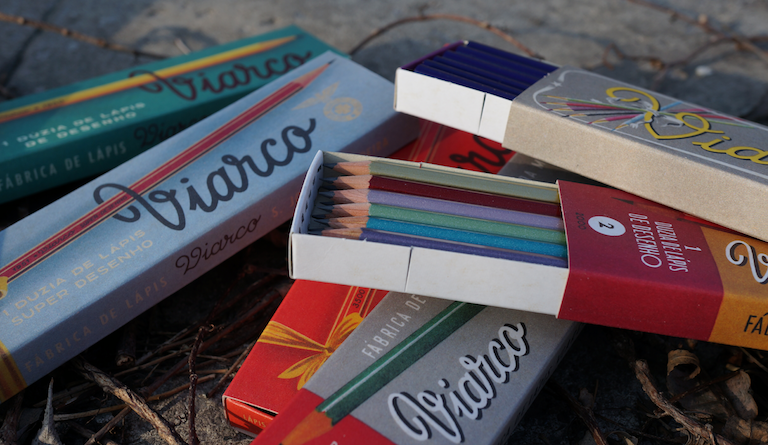
The six pencil boxes are housed in a black cardboard presentation box, so the set has 72 (a half gross) pencils in total, similar to many vintage boxes we’ve seen over the years.

Viarco Vintage Collection

The box has a cellophane wrapper with a sticker that notes:

This limited edition collection is wholly designed in Portugal using long-established production methods.

There is a bar code and these notations: REF. HRSETCX12 5601470505979

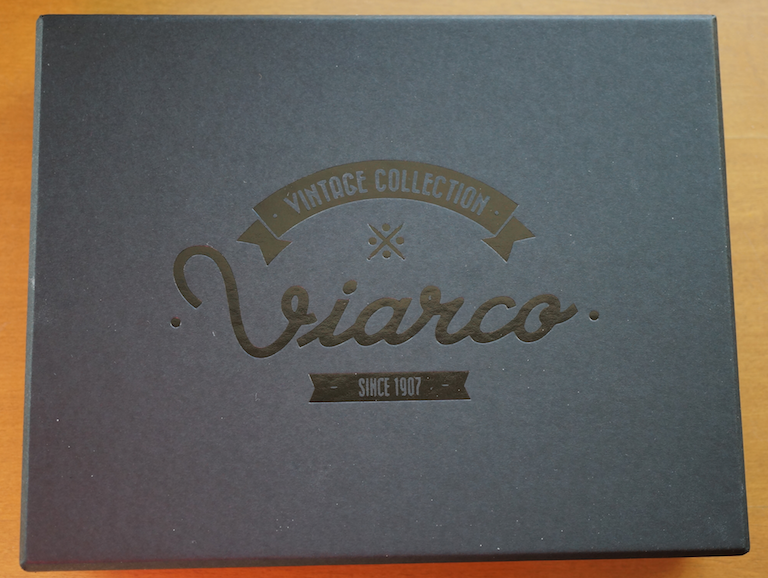
The box itself is matte black with a simple glossy graphic – “Vintage Collection Viarco Since 1907”.

Viarco Vintage Collection

Opening the outer box is a treat, as we see the individual pencil boxes:

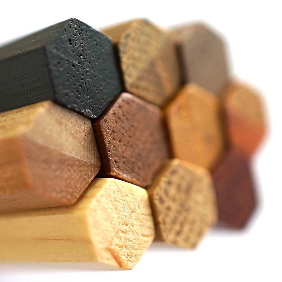
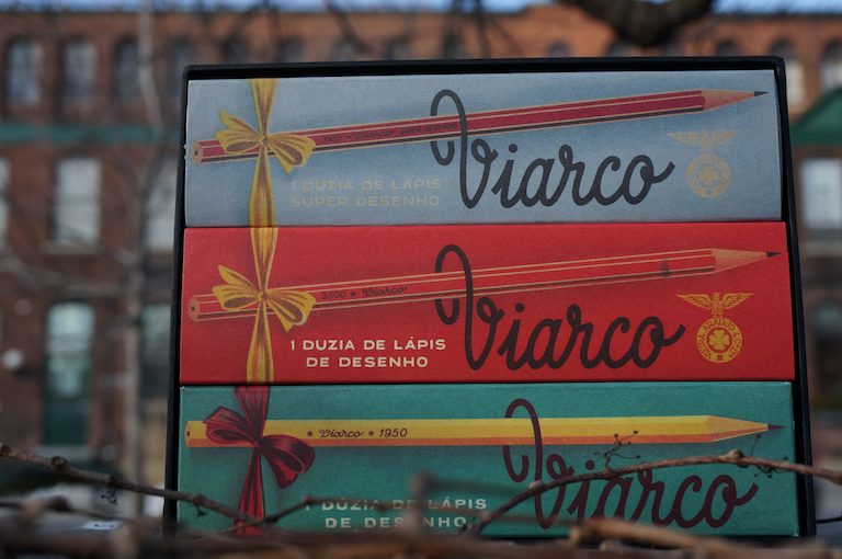
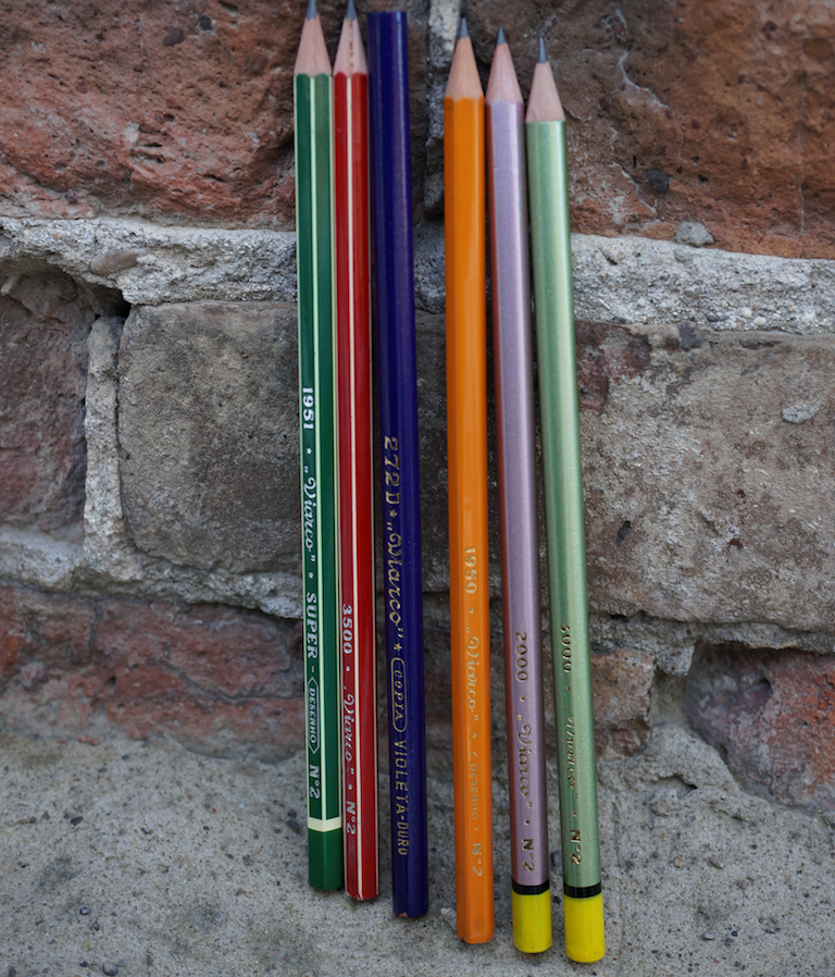
1. The 1951 Super Desenho – these are beautiful hexagonal pencils in green, purple, red, black, purple, and marigold, with white pinstripes. The marigold is the only one to feature a contrasting cap – yellow. The box is sliding, and blue.

2. The 3500, red hexagonal with white pinstripes. These have unfinished caps. They have a red sliding box.

3. The 1950 Desenho is yellow, uncapped, and hexagonal. The box is green with a folding closure.

Now we get to the second row!

4. The 272D Copia Violeta Duro is a round purple copying pencil that we looked at in 2008 as part of a larger article on copying pencils:

The hidden life of copying pencils

These are the only unsharpened pencils. They come in a colorful green/grey sliding box.

5. The 3000 – a round light metallic finished pencil in violet, turqoise, pink, red, yellow, and green. They have a yellow finished cap. The box is grey slider.

6. The 5000 – basically, an hexagonal version of the 3000. An orange sliding box houses the pencils.

Viarco Vintage Collection

The box also has an insert (Portuguese/English) discussing the set.

I love that there is a variety of pencil types, of packaging, of graphics, and with beautiful typefaces and historical themes.

Viarco Vintage Collection

This post has a special treat. A decade ago, online commerce was not as advanced, and this blog may have been Viarco’s first online customer. It was done in a way that would be hard to imagine now – back and forth correspondence, a bank draft, frequent communication. I was very impressed at what this company were willing to do for a single overseas customer.

The best aspect of this is that I’ve been able to keep in touch with Viarco over the years – and in particular with José Vieira, whose title is General Manager of Viarco – Fábrica Portuguesa de Lápis, though he likes to think of himself as just a pencil worker.

Viarco was founded in 1907, but found itself in financial trouble in 2011. José started working there in 1999, and is the fourth generation of his family to work at Viarco. In 2011 he and his wife Ana bought Viarco to ensure the company’s continuance. Here are a few questions for José.

pencil talk: What was the inspiration for the Viarco Vintage Collection?

José: The existence of original pencils and packaging, and the opportunity to make them again.

We have a friend that is a designer, and he chose Viarco to make a study of the design inside a PhD that he is doing in the university.

As you know we started to use some vintage packaging ten years ago, at first to sell them in Portugal where there exists a generation which has affection for them; now we would like to know if they could exist just by themselves in other countries and cultures outside of Portugal.

I think you know that Viarco produces several innovative materials and that we are very, very, very interested in what it can be in the future, but our roots are in the pencil factory. The project is to keep this ancient industrial installation working.

So it’s not a retro trend, it’s not a commercial goal, not even an academic project but once again the result of several people with different interests and needs working together to keep the knowledge and the memories available for those who like to dream of a different kind of society.

pencil talk: How were the six varieties in the set chosen? Are there other pencils you regret that you were unable to feature?

José: We chose those six because they represent a coherent language of a time period when Portugal was closed to the outside world due to the dictatorship and for that reason something that could be an authentic example of Portuguese design. And of course because they work well as a set.

There are several packaging types that would like to make again … Some of them we tried, but unfortunately there is a no one able to make the boxes, or we have already lost the tools to produce the pencil.

There are some limitations about what we can do and what our suppliers are able to produce. In the past when everything was done manually, and the cost of this kind of labour wasn’t a problem, they could make things that now seem impossible to reproduce, companies don’t know how to do it, don’t have a commercial interest in it, or even because it’s too expensive and for that reason unaffordable for this kind of material.

pencil talk: The Vintage Collection is not the first nostalgic or historically packaged item from Viarco. Is it correct that the modern Viarco has a special relationship with the company’s heritage?

José: … Answer nº1, plus as I told you before we are much more interested in the future than in the past, however here in the factory everything is from the past except the mindset of the people that work here and the people that we receive.

So its quite natural that the heritage influences everything that we do, and we try to respect it every time that we develop new products and packaging because this is a important part of our identity and authenticity.

pencil talk: What pencil is on your desk right now?

José: Dozens of damaged pencils that I take from production to try :-)

During the different processes of the pencil production all the damaged pencils start to being separated. Normally I take one or two of those to sharpen and try to see what happened.

So in my desk normally I have damaged pencils that, from time to time, I need to send the endless drawer because some are so nice that I want to keep them for future memory.

—-

My sincere thanks to José Vieira for his great generosity in taking the time to answer these questions. It was tremendously enjoyable to learn about his passion for Viarco.

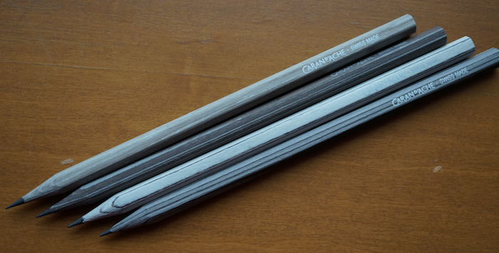
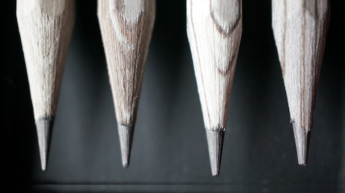
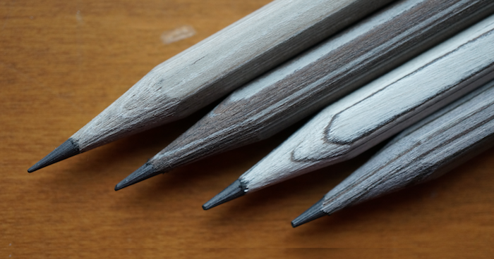
The outdoor photos were taken in front of the Toronto Carpet Factory and the former Central Prison Paint Shop, 19th century buildings in Toronto.

Other Viarco posts at pencil talk: Link

We have Stationery Fever

Stationery Fever is a recently published hardcover book that explores the modern stationery scene. The book is lavishly illustrated, and unique in featuring dozens of contributed essays and photos.

Stationery Fever

Title: Stationery Fever
Author: John Z. Komurki
Publisher: Prestel Verlag, Munich
Format: Hardcover, 208pp
ISBN: 978-3-7913-8272-2

The book has nine chapters on stationery subjects (pencils, pens, etc.) and thirty-one separate brief essays, mainly on brick and mortar stores and products.

The author’s name is not on the book’s cover (though is inside) and the multiple supplemental essays are largely written in the first person without attribution. Given the collaboration, it is little surprise that three full pages are required for just the copyright, credit, and acknowledgement pages. And even then, we don’t know the names of many of the essay authors. It also isn’t clear to me what parts of the content may have been published in translation.

The book is a delight, and nicely covers a lot of themes that I sympathize with. It correctly recognizes the pencil as worthy of contemplation. The multiple points of view are also a breath of fresh air.

There is an amazing unity in the viewpoints of stationers – whether in Asia, North America, or Europe, natural lighting (if possible) highlights white tables that display high quality artfully arranged stationery items. The preference is for goods made by hand, and locally if possible. The tactile is emphasized.

Product essays are devoted to the familiar – the Parker 51 (in 2005, when pencil talk started, the ’51’ was pretty much the online favorite writing implement), the Eberhard Faber Blackwing, and to the new – the Neri leadholder and the Faber notebook.

There is an essay by Gunther from Lexikaliker on the Grenade sharpener, and the Blackwing article appropriately interviews the Blackwing’s leading chronicler, Sean of the Blackwing Pages. I expect 2017/18 to offer more new published writing on pencils than we’ve seen in decades, and this book is a harbinger.

The book will appeal to anyone interested in the constituent subjects. I read it cover to cover on two weekend afternoons. Even subjects that weren’t particularly high on my radar, such as “Glue”, were really interesting. A comparison of the Pritt stick vs. the UHU stick, as an example. The intriguing story of the first adhesive tape (Dr. Horace Day, Surgeon, 1845) through to the Post-It Note (Dr. Spencer Silver, 3M Scientist, 1968). The only issue is the lack of citations, for those of us who would like to read further.

The book is a two-in-one – a nice review of many stationery topics/histories, plus an anthology of contributed essays and photos. It is a delight.

Les Crayons de la maison Caran d’Ache, Edition No. 6

Caran d’Ache has continued their “crayons de la maison” series with a sixth edition. The pencils are a visual delight, and a bit of a construction mystery.

Les Crayons de la maison Caran d’Ache, Edition No. 6

The appeal is obvious – rich, amazing wood patterns from exotic species. They echo the 1990s Colleen Woods Pencils that are quite admired.

This set is somewhat monotone and features:

Western Hemlock
White Oak
Silver Teak
White Ash

Les Crayons de la maison Caran d’Ache, Edition No. 6

I wish the individual pencils had a small numeral or marking to note which pencil is which.

The pencils come in a sliding cardboard box, and an external sticker indicates:

Caran d’Ache 0361 414
Bar Code: 7 630002 334990
Made in Switzerland
FSC Mix wood from responsible sources FSC C005365

We can look up the FSC number. Nothing too interesting here. Sometimes we can discover a manufacturer or subcontractor’s name by looking up this code.

Les Crayons de la maison Caran d’Ache, Edition No. 6

A second sticker says, “Crayons Parfumés Par Mizensir”. In other words, these are scented pencils.

The scent is strong! In contrast with Viarco’s scented pencils, which require me to approach them closely before any olfactory warnings start signalling, I can detect the Mizensir scent from several feet away. Fortunately, it does seem to dissipate with time. (Mizensir is a Geneva perfumer.)

Since last featured, we know much more about this pencil series, and the vendor’s own description has been updated. Particularly informative are the comments at a 2014 post at Lexikaliker.

The pencil box notes that these pencils are made from “reconstituted wood” which they also call “essences”. ALPI is the manufacturer, and are a specialty firm in wood tasks such as creating an oak look from the woodchips of another species.

Les Crayons de la maison Caran d’Ache, Edition No. 6

The pencils are not made from the represented exotic woods. I think even using the word “essence” is going too far – ALPI is clear that they use Poplar, Limewood, or Ayous. There is no Hemlock, Oak, Teak, or Ash in these pencils. And they weren’t made from glued together pencil slats. It is some other process, perhaps extrusion, that constructed the pencils.

Yet, they’re nice, they are innovative, and they distinguish themselves quite well from ordinary pencils. It is also quite amazing that Caran d’Ache has continued the series over three years – there is obviously a market for innovation in pencils.

See also:

Les crayons de la maison Caran d’Ache

Les crayons de la maison Caran d’Ache, Edition No. 2

pencil talk 2.0

Hello all,

It has been three years since the ‘Final Post’ at pencil talk.

After announcing the end, I took the blog offline for several reasons. I don’t really like seeing blogs floating around that don’t function as blogs, with no new posts, no commenting, no interaction. The hosting costs seemed to only be going up. And, it just seemed appropriate to turn off the lights after leaving.

I’ve continued to keep in touch with many people interested in pencils, and appreciate the queries from readers. These interactions have been persistent enough that I feel the impact of the blog was quite significant. From the other side, going offline didn’t cause costs to decrease by much. Using a prominent hosting company, everything is metered, and maintaining virtual servers, storage, etc. seemed to cost more than the bandwidth – i.e. there were few savings found by turning the blog off.

The last three years have been an adventure. I’m from Toronto and started the blog there, but lived in nearby Kitchener many of pencil talk’s nine active years. In 2013, I accepted a job offer in the US, and lived in the San Francisco Bay Area until two months ago. I’ve just returned to Canada.

I brought the blog back online for a couple of reasons – I didn’t really want the content to be lost – it lived inside the WordPress database on an operating system too old to get updates – and, at some point, a revival would become unfeasible. But more importantly, the blog isn’t solely mine – discussion with and between readers was one of the things the blog did well, and the many thousands of comments deserved to live on. The blog never reached first place in search engines, but it always seemed the be the place for people to talk about pencils.

This post is about a revival – I want to bring the blog back. I’m still thinking carefully about this. The online landscape has changed. There are a lot more stationery blogs and websites now. Many are decidedly commercial. The three blogs I mentioned in ‘Final Post’ have all continued to thrive, and I’ll note in particular that Contrapuntalism has risen to unprecedented heights – featuring interviews with both the late Count A.W. von Faber-Castell and Eberhard Faber IV that have delighted and amazed me.

I want to carry on the exploration of the art and science of pencils, and hope you’ll join along!

Stephen