Graf von Faber-Castell Guilloche pencils

Graf von Faber-Castell Guilloche pencils

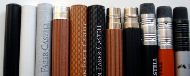
There were some queries about a particular pencil shown in the previous post. That pencil of interest is the Graf von Faber-Castell Guilloche pencil.

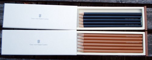
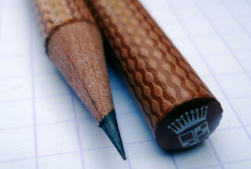
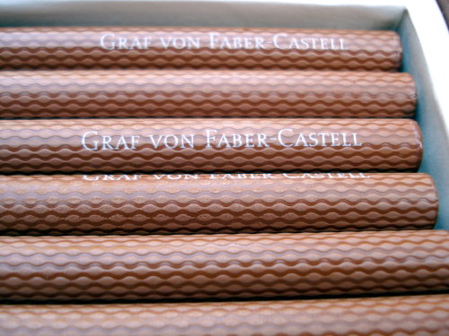
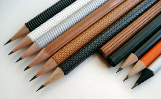
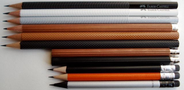
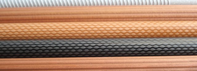
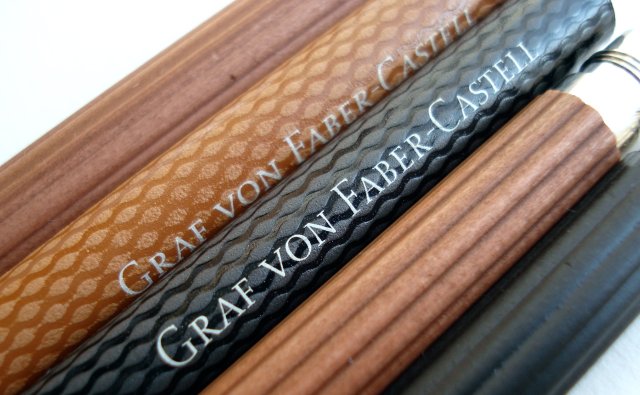
Recently introduced, it is a round pencil with a diameter of about 8.15mm, with a very intricate finish.

Graf von Faber-Castell Guilloche pencils

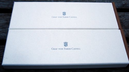
It is presented in a modest but pleasing cardboard box:

Graf von Faber-Castell Guilloche pencils

For those seeking the pencils, they are formally (at least in English) called “superfine pencils with guilloche finish”, and the model numbers are “11 86 21” for the brown, and “11 86 20” for the black.

Graf von Faber-Castell Guilloche pencils

I find them to have a very pleasing and subtle sophistication. My only complaint is that the factory sharpening shows an unpleasant rough scraping of the wood. Although that’s very common with modern pencils, the original ribbed, silver-capped Graf von Faber-Castell pencils don’t have this problem, and these newer pencils in the same line shouldn’t either.

Graf von Faber-Castell Guilloche pencils

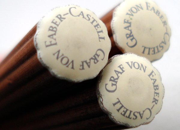
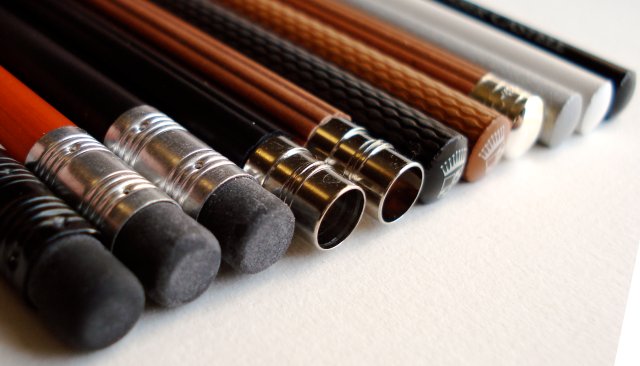
The caps display a crest and crown.

Graf von Faber-Castell Guilloche pencils

The official product page is here.

See also:

Pencil Boxes (II) – Graf von Faber-Castell (pencil talk – February, 2008)

Graf von Faber-Castell pencils. (pencil talk – July, 2006)

Faber-Castell – 21st century pencil manufacturer

The pencils of Faber-Castell

This is almost an accidental post. While arranging some office supplies, I noticed that I had accumulated a few of Faber-Castell’s “special” pencils – their design series pencils, the Graf von Faber-Castell pencils, and “perfect pencil” refills.

Individually, they are all nice, but together they display an amazing array of achievement in modern pencil manufacturing.

The pencils of Faber-Castell

Today’s best pencil or best manufacturer may be debatable – but on the design front – I don’t think there is a competitor.

The pencils of Faber-Castell

I respect the utilitarian history of the pencil. And these pencils are highly usable – well made, solid, possessing excellent grips, and having good quality leads.

Yet they don’t exactly scream ‘utilitarian’. They stand out because of their wonderful design and the clear commitment to create something exceptional in an era when using handheld writing instruments is a choice.

The pencils of Faber-Castell

The textures and surfaces amaze and delight.

The pencils of Faber-Castell

Approaching their 249th anniversary, Faber-Castell seems to be full of innovation.

The pencils of Faber-Castell

What pencil could celebrate their 250th anniversary?

The pencils of Faber-Castell

Leuchtturm 1917 notebooks

Leuchtturm 1917 notebooks

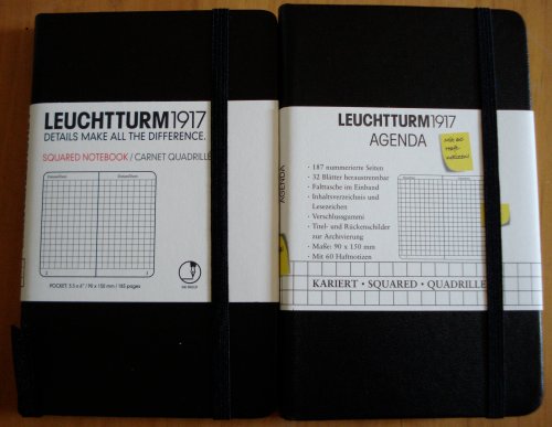
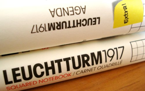
Here are two Leuchtturm notebooks. One sourced in Canada, one in France.
Leuchtturm 1917 notebooks

Leuchtturm (meaning “lighthouse”) is a German philately and numismatic supply company founded in 1917. Among their offerings are specialty supplies for collectors – a particular item I find very intriguing is an album for collecting the metal capsules that crown Champagne corks! Who knew? And who retains that sort of collecting determination after downing a bottle of Champagne?
Leuchtturm 1917 notebooks

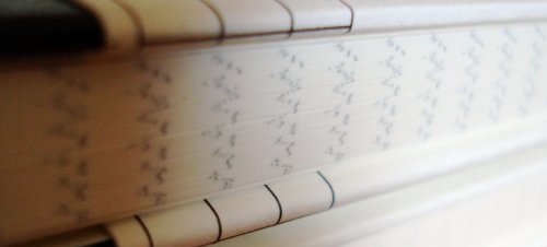
These are pocket sized notebooks with hard covers. They have an elastic enclosure band, a page marker ribbon, and a pocket inside the back cover.

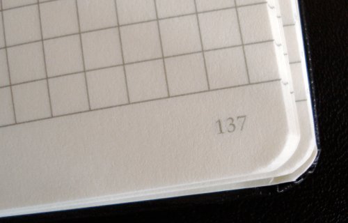
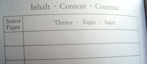
They also have a feature that I love – numbered pages and a blank index section! This is a great solution to the problem of finding what one has written down. Plus, the numbers look like they belong, using the same font and ink colour as the rest of the text. There are laboratory and accounting notebooks with this feature, but many that I’ve seen appear as if they were stamped via a separate and unrelated printing process.
Leuchtturm 1917 notebooks

Leuchtturm 1917 notebooks

So congratulations, Leuchtturm. Page numbering is one of those little things which makes all the difference. For me, it’s a great benefit because I do write down things that I want to quickly retrieve later.

Here’s what I’m puzzling about. My two notebooks have a number of differences:

– Both are 90x150mm, but the Canadian one has 185 pages, while the French one has 187 pages. The interiors are physically the same, but the arrangement of blank pages around the index varies.

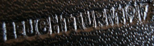
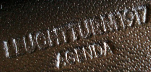
– The French version is stamped Leuchtturm 1917 Agenda, while the Canadian version is simply “Leuchtturm 1917”.
Leuchtturm 1917 notebooks

Leuchtturm 1917 notebooks

– The last eight pages of the Canadian version are detachable (starting at page 171), while 32 pages of the French version are detachable (starting at page 125).

– The French version came with 60 sticky notes on a card that fits nicely in the back pocket. The card’s back side has a ruler, and some unit conversion tables – a nice touch.

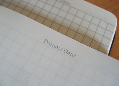
– The page lining imprint is remarkably different. Though the same pattern, The Canadian version is subtle and faint, while the French version is strong and bold. It’s hard to say if it’s just a difference between print runs.
Leuchtturm 1917 notebooks

In either variant, they are nice notebooks. Leuchtturm has other sizes, as well as a lattice or dotted grid format that I’ll show another day. I’ve been using a Graf von Faber-Castell pencil in the Canadian version for a few days, and have encountered no problems.

[Update: December 2, 2009]
I asked Leuchtturm about this, and the ruling differences represent different generations of the product, not regional variations. The light rules are the new format, and are being introduced first in Canada and the US.

My thanks to Leuchtturm for their assistance.
Kiki James Tuscan Wrap Journal

Kiki James Tuscan Wrap Journal

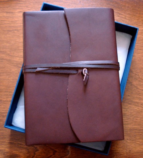
From Kiki James we have the Tuscan Wrap Journal. It is a leather bound journal available in several colours, in three sizes, with lined or blank paper. The beautiful example shown here is the chocolate bridle finish, in medium with lined paper.

Kiki Jones is a relatively new online retailer based in London. Their domain name was registered in 2005, so that provides a hint at their longevity. They state that they do welcome customers at their headquarters. Kudos to them for providing walking and public transit directions!

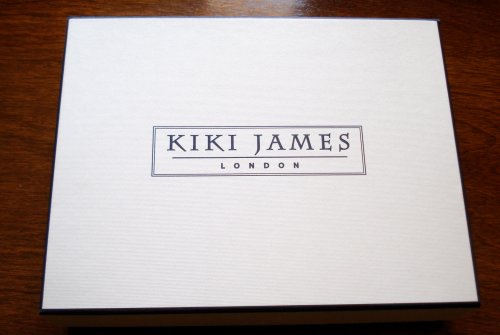
The first thing one notices is the box. At a time when generic plastic shrink-wrap has almost become a retail standard, the journal’s presentation is outstanding. The journal itself arrived tissue-paper wrapped, resting on a tissue cushion on the box bottom.

Kiki James Tuscan Wrap Journal

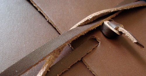
The journal itself has a wonderful smooth luxurious leather finish, and can be closed by double-wrapping a leather tie:

Kiki James Tuscan Wrap Journal

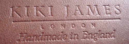
The back reveals a discreet embossing. “Handmade in England” is another welcome departure from today’s norms.

Kiki James Tuscan Wrap Journal

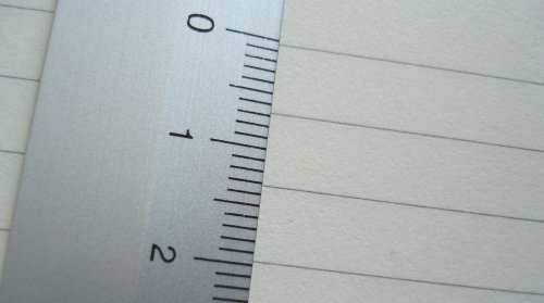
The journal is 21.6cm x 15.2cm, and the rules on the thick, creamy, paper are grey, approximately 6.5mm apart.

Kiki James Tuscan Wrap Journal

The outside is as smooth and rich as it appears, while the inside is rough with the journal firmly inset.

Kiki James Tuscan Wrap Journal

Just one of a number of leather writing journals from Kiki James, I am very impressed with the offering. My thanks to Kiki James for providing the item for this review.

Two more black dyed pencils

Black dyed pencils

Here are the plainest black dyed pencils we’ve yet seen.

From Kirin, a smaller Japanese manufacturer, is the Black Pal. It features a black ferrule and black eraser.

As well, a no-name pencil with no markings, with an unfinished cap.

Black dyed pencils

The Kirin has a much nicer lead, but the pencil’s appearance and handling are diminished by a prominent seam down the pencil’s side.

Black dyed pencils

Both are nice overall, and embrace the all-black appearance even further than the pencils we’ve previously looked at.

Black dyed pencils

See also:

Five Black Dyed Pencils

Kirin Black Pal product page

Felissimo 500 Color Pencils – 2nd set

Felissimo 500 Color Pencils

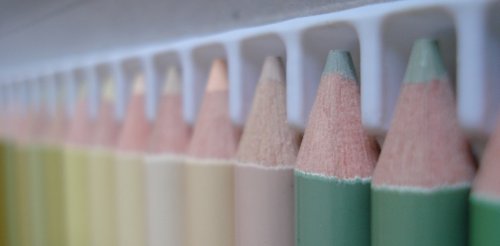
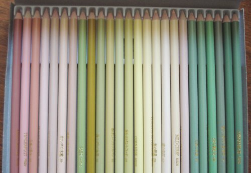
Here is the second set of pencils from Felissimo’s series of 500 colors.

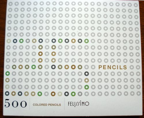
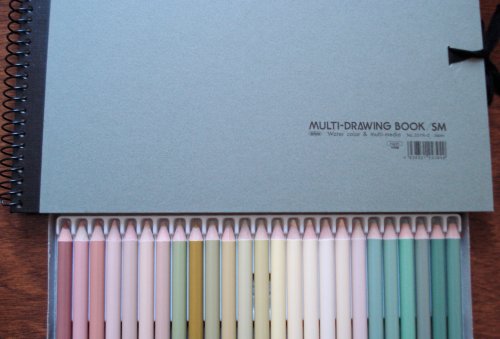
Again, the packaging is impressive:

Felissimo 500 Color Pencils

Felissimo 500 Color Pencils

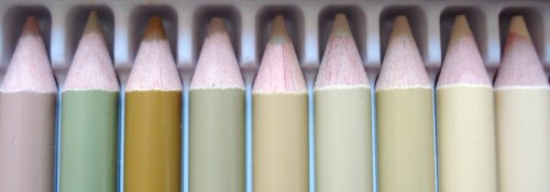
This month’s palette is hard to describe in a single word – the focus is on muted pinks, creams, pea greens, and mint greens. I was somehow expecting something like last month’s bright reds – perhaps another set of bright primaries, but also welcome this surprise.

Felissimo 500 Color Pencils

Felissimo 500 Color Pencils

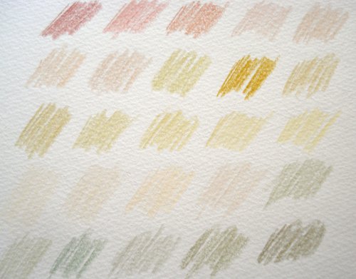
I did try them out, and realized that the pencil pigments are much subtler than the lacquers on the pencil surfaces – matching 500 sets of pigments with 500 surface lacquers must be a significant part of the manufacturing challenge.

That ninth pencil, called Mrs. Parson, stands out in both surface lacquer and on paper.

Felissimo 500 Color Pencils

Felissimo 500 Color Pencils

There were a few questions after last month’s post on the first set, and I recommend that those interested take a look at Felissimo’s “Frequently Asked Questions” page via the banner below. For example, on the issue of lightfastness, Felissimo state that a small sample of pencils have been tested, and all are 4/5 or 5/5 on the JIS lightfastness scale. JIS is the Japanese Industrial Standards section of the Japanese Standards Association. While probably insufficient data for professional artists, I think this speaks well about the pencils from the quality persective.

I can’t wait to see what the next 25 pencils look like!

See also:

Felissimo 500 Color Pencils – 1st set