Earlier this year, we noted an interesting article on the current state of the pencil industry.
From Time Magazine’s archives, here is an overview published in 1932.
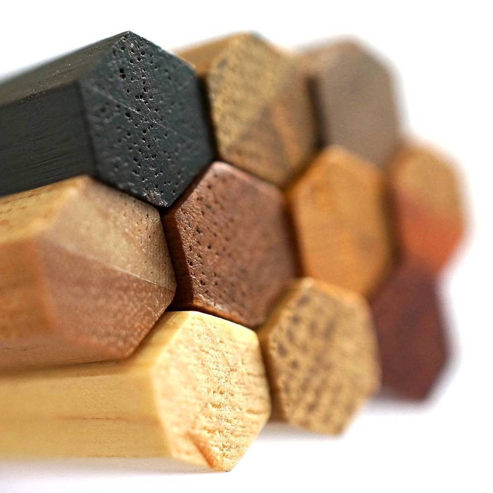
exploring the art and science of pencils since 2005
Earlier this year, we noted an interesting article on the current state of the pencil industry.
From Time Magazine’s archives, here is an overview published in 1932.

This pencil looks like it could be a marketing or novelty item. It lacks an imprinted name or model number. The pencil is made and sold by Caran d’Ache under their own name as part of a larger product campaign.
The graphic is striking – a red background, with white crosses. The matching ballpoint pen is sold as the ‘Swiss Flag’ pen in the ‘Essentially Swiss’ series, so I am calling this the Swiss Flag pencil. Let me know if you have a more correct name!

This associated set is interesting in itself. There are many matching pen and pencil sets – with ‘pencil’ meaning ‘mechanical pencil’ – but I can’t think of another set where one can buy a ballpoint pen and matching woodcase pencil.
The pencil is round, with a silver coloured ferrule and white vinyl eraser.

One pencil had a lead break while sharpening, but I couldn’t repeat that problem. The top photo shows an imperfect sharpening, with maybe a bit too much wood sharpened away. I would blame the sharpener, except that the sharpener continues to do fine with other pencils – and I tried more than one Swiss Flag pencil, more than once. So, I think the photo reflects my experoence.
The lead isn’t a standout, though not bad.
Overall, I think it is a nice, not too serious, fun pencil.

The offerings of Caran d’Ache continue to intrigue.
At first glance, the 351 resembles the Technograph 777. But wait – there is a ferrule and eraser attached.
And the bar code is back in black, imprinted on the pencil’s reverse side. No nice peel-off plastic as was done with the Technograph.
I tried the 351 (a 351-2 to be exact) next to an HB Technograph 777. I really had to do quite a bit of testing to try and convince myself of the Technograph’s superiority. I wasn’t completely successful. In the end I would say that these pencils are very similar – in that range where differences aren’t immediately clear.

While I don’t have any official context, the 351 would seem to be an office or school pencil – but it writes as well as the high end version. Good stuff!
I don’t usually evaluate erasers on woodcase pencils, but I tried the white vinyl eraser on the 351, and it is a surprise, being quite good on a variety of types of paper.
Another point of interest is the FSC (Forest Stewardship Council) logo on the pencil. This would make it one of the first retail pencils from a major manufacturer to carry this statement.
Overall, the 351 is a very impressive pencil.
With Faber-Castell’s 250th anniversary three years away, preparations have no doubt begun for some very special pencil products from the world’s oldest pencil manufacturer.
Here are three of my ideas for fantastic pencil offerings I would love to see:
1. A historic woodcase pencil series, with perhaps five different eras (one for each half-century) of pencils recreated in their original dimensions and finishes with modern materials.
2. A series of pencils in an extensive variety of woods. (This idea from the catalogue Pencils)
3. A pencil box – a modern, adult pencil box meant for a desk that could house a gross of pencils, in wood with silver or platinum hardware.
Any other ideas?
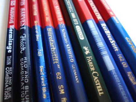
Well, I now have a Conté Television 649 red and blue pencil, as well as three other members of the elite red and blue pencil cadre.
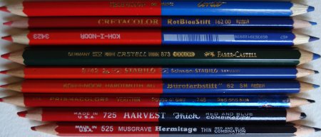
The pencils are the Television 649, made by Conté in France, the RotBlauStift 162 00 from Cretacolor, made in Austria, a Koh-I-Noor 3423, origin unstated, and a Castell 873 Color by Faber-Castell, made in Germany.
The RotBlauStift is a regular sized hexagonal pencil, while the other three are oversized hexagonal pencils.
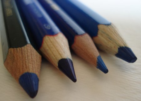
A few notes:
– Faber-Castell is definitely the rebel here, eschewing the standard red and blue for their signature forest green. I wish they hadn’t done this. There are occasions when respecting a tradition should trump branding concerns.
– The Koh-I-Noor has exceptionally utilitarian markings, with the name imprinted via something akin to a dot matrix printer.
– The Television’s wood has the same sort of look as the Grip 2001 pencil – jelutong or pulai.
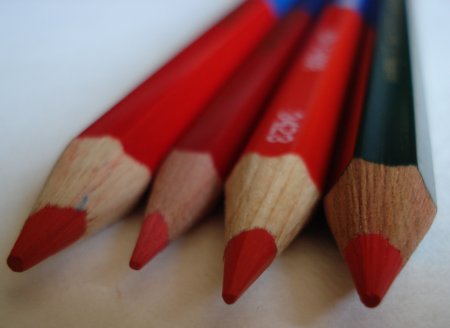
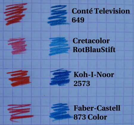
As with our previously examined red and blue pencils, there is a range of colours – the Cretaclor is light in both red and blue, the Koh-I-Noor bright and rich in both, and the others somewhere in between.
Here are trial results with the four new pencils:
Let’s summarize the main features of the red and blue pencils that we have looked at so far:
| Manufacturer | Model | Shape | Oversize | Core |
| Conté | Television 649 | Hexagonal | Yes | 4mm |
| Cretacolor | RotBlauStift 162 00 | Hexagonal | No | 2mm |
| Faber-Castell | Castell 873 Color | Hexagonal | Yes | 4mm |
| Koh-I-Noor | 3423 | Hexagonal | Yes | 4mm |
| Koh-I-Noor | Bürofarbstift 62 | Hexagonal | No | 2mm |
| Musgrave | Hermitage Thin 525 | Hexagonal | No | 2mm |
| Musgrave | Harvest Thick 725 | Round | No | 4mm |
| Prismacolor | Verithin 748 | Round | No | 2mm |
| Schwan-Stabilo | Stabilo 8742 | Hexagonal | No | 2mm |
These traditional pencils associated with teaching and accounting still have a strong resonance. While the keyboard has supplanted pens and pencils in many areas, it is fascinating that this sub-specialty of the woodcase pencil still continues. All of these pencils shown are in active production by their manufacturers.
Further reading:
Red and Blue pencils (February, 2008)
Red and Blue pencils II (March, 2008)
This page at stdk.de, which has documentary quality photographs of several red and blue pencils, plus a list of known red and blue pencils in production.
The Caran d’Ache Grafwood pencil is intriguing.
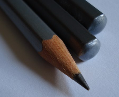
The pencil is a rounded hexagonal shape, a millimetre or two wider than the Technograph.

It has a silver finish, with the very interesting feature of the finish colour corresponding to the lead degree – lighter pencils in a lighter silver, and darker pencils in a darker silver. Each pencil degree is slightly different. This is a great feature, and a huge advance over a degree marking (e.g. ‘B’), possibly hard to read, on the pencil. Of course, this comes at a price to the consumer.
These pencils remind me of Derwent’s offerings. I am remiss in not yet having written about a Derwent pencil here, though I regularly use them.

Derwent has a ‘Graphic’ line, and a ‘Sketching’ line. The Graphic pencil is hexagonal, in a typical pencil diameter. The Sketching pencil is round, slightly larger, with a larger graphite core. The idea is that the form factor supports rich lines and easy freehand drawing.
The Grafwood is similarly conceived – a larger diameter pencil (though hexagonal), for easy grip and sketching. Visually, it appears to have a larger than standard (i.e. 2mm) core, but I don’t really want to sacrifice one of the few I have just for dissection.
The lead seems to be at least of the same calibre as the Technograph, and possibly better.

At a 2B grade, the graphite seems to be much more solid and non-crumbling than the corresponding Derwent pencil, while giving just as dark a line.
I really like these pencils, and I encourage Caran d’Ache to seek more distribution for their products – I haven’t yet seen anything from their graphite pencil line that isn’t first rate.