Faber Castell 9000

An abundance of Faber Castell 9000 pencils.

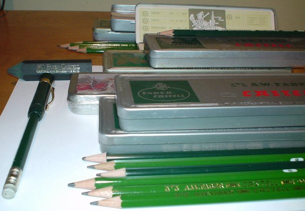
The new Faber Castell 9000 centennial tin has a traditional graphic of mounted knights duelling. What a careful examination reveals is that the knights are duelling with pencils – the victor with a Faber Castell 9000, and the losing opponent a broken yellow pencil. The yellow pencil might represent a rival manufacturer’s product, or the generic office pencil. Whatever the case, there is no doubt about Faber Castell’s commitment to recognizing their product’s history and heritage.

The tin comes with 12 sharpened HB Faber Castell 9000 pencils, and a green plastic eraser. I have a number of original tins, and this newer box is a nice revision. It differs in having an eraser rather than foam to cushion the pencils during transport. (The pencils are thus a bit shorter than their predecessors). This is very sensible – foam disintegrates with time, but the eraser also acts as a cushion to the pencil points during shipment, and is additionally a useful object once the box is opened. It’s also nice to see the commitment to attractive packaging and the upscale market placement of these pencils.

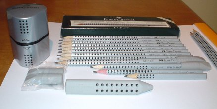
These pencils are also available individually, in a wide variety of grades, and a “matching” eraser (pencil shape) is available. (The Grip 2001 line also offers a matching eraser.)

A variation is the “perfect pencil” – a four function cap that serves as a pencil extender when placed on the pencil crown, a protective cap when placed on the point, a clip provider – and – has a pull out sleeve with a built-in sharpener. With an eraser-capped pencil (with quality white plastic, and not generic office supply store pink), the perfect pencil stands as an incredible pencil innovation, solving several pencil user issues – portability, point protection, pencil extension, sharpening and erasure – in a small logical device that adds very little weight or bulk to a pencil. The ability to create such a brilliant and practical object demonstrates why Faber Castell leads the world in their field.

The pencils? Oh yes the pencils… they are superb. Along with a select few others, they are an art and design staple. They are hexagonal, a handsome forest green (darker than predecessor 9000s) with gold lettering. A URL on the side is a tip-off that they are new. They sharpen without fuss, and I’ve had no lead breakage. The graphite seems to have it all – smooth, non-breaking, keeps a point, and solidly dark for the grade. Even a 4B seems to last quite a while. The casing halves are matched, and the varnish comfortable. It is clearly manufactured to the highest standards.

The looks are traditional compared to a Grip 2001, but a pencil that been made since 1905 is something to contemplate, and the quality is first rate. Overall, it ranks as one of the great woodcase pencils, one that deserves recognition for a century of quality and production. Congratulations, Faber-Castell!

Faber Castell Grip 2001

The splendour of the Faber Castell Grip 2001 line.

At a time when it wasn’t believed there was anything more to add to the common pencil, came a tour de force from the world’s oldest and most important pencil manufacturer. This stunning triangular shaped silver coloured pencil with raised black dots on the sides immediately became an icon of industrial design, winning numerous international awards and being named the Business Week’s “Product of the Year”. A pencil? Yes, a bold new pencil that stepped forward with innovative new features and a look that placed it in the realm of high end writing instruments and fashion.

A marketing campaign that placed the pencil in art stores, quality stationers, and fountain pen shops accompanied by attractive merchandising was the essential companion in gaining attention. Arts sponsorship and pencil themed fashion shows were among the noteworthy campaigns.

Making almost two billion pencils a year, Faber-Castell is the world’s largest pencil company. Their pencils were the world’s first branded writing instruments, and their corporate origins are in the eighteenth century. It seems they haven’t reached these heights by resting on past accomplishments. The UFO eraser and sharpener, the perfect pencil – each of these would be an incredible achievement on it’s own. But Faber-Castell keeps pushing the boundaries of the what a pencil can be. The potential position in the public consciousness is elevated by each new addition. Even a new eraser wins design awards. Nothing is ordinary about their creations.

The pencils are simply beautiful. They are both functional and attractive. The triangular shape fits the hand nicely, and the black dots do assist with “grip”. (Unfortunately, in high humidity, they do get a bit tacky, and can stick to other objects.) There are nice hidden touches – the head of the eraser-less pencil is black, with the shade corresponding to the hardness of the graphite. Of course, they’re also labelled on the side.

It’s the sort of pencil that gets the attention of people who don’t like pencils, and the renewed devotion of those who already have them at their desk. Of course, those who like the ordinariness (and price) of the office supply store dull yellow pencil, perhaps as a badge of honour, won’t want this upscale version.

There is a matching triangular eraser (also produced in at least red and blue) available, or matched eraser caps, sold in pairs. Of course the pencil looks so nice that a stylish UFO eraser seems made for it.

They come in five hardnesses, 2H, H, HB, B, 2B, and so are meant more for writing rather than drawing. I’ve used them for about four years, and some leads are better than others – the odd one seems a bit scratchy, or breaks in such a way that there are two pencil lines. That can be a bit annoying, but is luckily not the norm. I also notice that the pencil’s halves are sometimes a bit mismatched in colour. This isn’t a serious problem – in fact I believe the pencil’s amazing looks highlight the little imperfections.

Can Faber-Castell top this pencil? I don’t see how, but I’ll keep watching.

Invisible Ink

Herbin Invisible Ink
One of the most whimsical and intriguing items in the world of writing instruments and stationery is invisible ink. To me, it recalls childhood experiments with lemon juice and Encyclopedia Brown books. To others, it may be studied as a practical form of steganography.

To my surprise, I learned that the world’s most distinguised ink maker manufactures a commercial invisible ink, and that I could buy it at a local shop.

The packaging is charming. A bottle with a simple frame pattern label reading:

Encre

Invisible

30ml J. Herbin

It’s light pinkish colour, and fountain pens are not recommended. My bottle shows significant signs of crystallization around the cap and top of the bottle after light use, so that’s probably why.

Although I’d love to buy a fancy dip pen, for now a General’s nib holder and some Speedball nibs suffice. A blank Rhodia pad also seems in order. I start scribbling away.

Is it invisible? Well, it’s less visible. The ink is wet, and there is a slight tint, so the very curious can probably tell that the paper isn’t as prisitine as it once was.

I let the paper dry and take it to my halogen lamp. Holding it near, the writing slowly comes to life in an aquamarine blue. This is thoroughly fascinating to see. What’s almost as intriguing, is that walking away from the lamp, the ink fades back to “invisible”, as if one saw the paper reveal a secret, temporal message.

Is it truly a method for secret record keeping and communication? It probably suffices for some purposes.

Some possible uses for invisible ink:

  • Love notes
  • Communicating passwords
  • Sketching tentative ideas
  • Blackfeet Indian Pencils

    The classic Blackfeet Indian Pencil.
    The Blackfeet Indian Pencil is a unique creation. It is a quality pencil that has a varnished natural wood encasing that was years ahead of others in recognizing that the natural beauty of wood grain could be embraced by the public, if presented properly. The varnish is thick and polished – it doesn’t look like (and isn’t) something one would find at a generic office supply store.

    The original had black imprinting with a small horse and rider logo, and the words “THE BLACKFEET INDIAN PENCIL” and the digit 2 for the lead hardness. There is a silver ferrule and light pink eraser. It writes nicely and the lead doesn’t crumble or splinter. A later version had a black ferrule and dark pink eraser. Unfortunately, this later version doesn’t maintain the quality of the classic version – the varnish is thinner, making the pencil less pleasant to hold, and the black ferrule doesn’t match the pencil as well, and can distract the eye.

    The pencils were made in Browning, Montana by the Blackfeet Indian Writing Company as part of a tribal owned economic initiative. I gather up to a hundred people may have been employed at the company’s peak, but it sadly appears to have been dormant the last few years.

    Rhodia Pads

    Rhodia pads

    The Rhodia pad is an icon for many. The classic pad is easily recognizable by the famous orange cover. It’s a model of efficiency and design – the front cover has three designated folding points, known as scores, which allow the cover to be neatly folded over the back. The standard pad has 80 sheets of fountain pen friendly 21.3 lb. “High Grade Vellum Paper”, with a light purple squared 5×5 mm rule. The sizes range from 3.3″x4.7″ ( 8.5cm x 12cm) to the magnificent desk filling 12.5″x16.5″ (31.8cm x 42cm) . It’s not too hard to learn this – the backs of the larger pads all have charts of the standard offerings. The sheets have perforations that line up with the top score so that the pad stays neat as sheets are removed.

    Apart from the classic pad, there are ruled and blank versions, and a special accounting variant. There are also a couple of yellow paper models, and the delightful No. 120, the Rainbow model with four colours of punched A4 graph paper!

    The Rhodia line also has coil ring notebooks (which one wouldn’t typically classify as “pads”) and even a graph paper mouse pad, with detachable sheets. I won’t discuss these here.

    I first discovered these pads when I saw the No. 38 (the giant 12.5″x16.5″ pad) at a local fountain pen shop a few years ago. It just looked awesome to me. I had never seen such a giant pad of graph paper. I like to draw charts and figure things out on paper, and it just seemed like a very useful aid. Also, the paper itself is much nicer than found in the writing pads at typical office supply stores.

    Here’s a link to their corporate catalogue:
    Rhodia