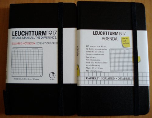
Here are two Leuchtturm notebooks. One sourced in Canada, one in France.
Leuchtturm (meaning “lighthouse”) is a German philately and numismatic supply company founded in 1917. Among their offerings are specialty supplies for collectors – a particular item I find very intriguing is an album for collecting the metal capsules that crown Champagne corks! Who knew? And who retains that sort of collecting determination after downing a bottle of Champagne?
These are pocket sized notebooks with hard covers. They have an elastic enclosure band, a page marker ribbon, and a pocket inside the back cover.
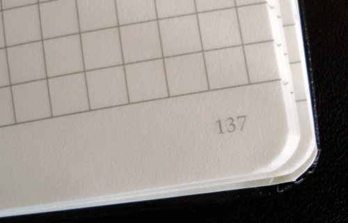
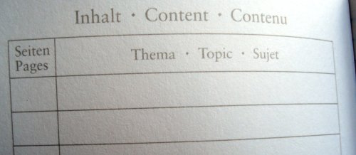
They also have a feature that I love – numbered pages and a blank index section! This is a great solution to the problem of finding what one has written down. Plus, the numbers look like they belong, using the same font and ink colour as the rest of the text. There are laboratory and accounting notebooks with this feature, but many that I’ve seen appear as if they were stamped via a separate and unrelated printing process.
So congratulations, Leuchtturm. Page numbering is one of those little things which makes all the difference. For me, it’s a great benefit because I do write down things that I want to quickly retrieve later.
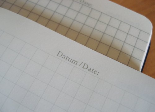
Here’s what I’m puzzling about. My two notebooks have a number of differences:
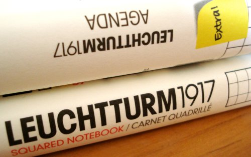
– Both are 90x150mm, but the Canadian one has 185 pages, while the French one has 187 pages. The interiors are physically the same, but the arrangement of blank pages around the index varies.
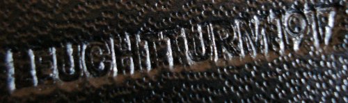
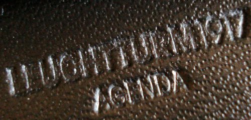
– The French version is stamped Leuchtturm 1917 Agenda, while the Canadian version is simply “Leuchtturm 1917”.
– The last eight pages of the Canadian version are detachable (starting at page 171), while 32 pages of the French version are detachable (starting at page 125).
– The French version came with 60 sticky notes on a card that fits nicely in the back pocket. The card’s back side has a ruler, and some unit conversion tables – a nice touch.
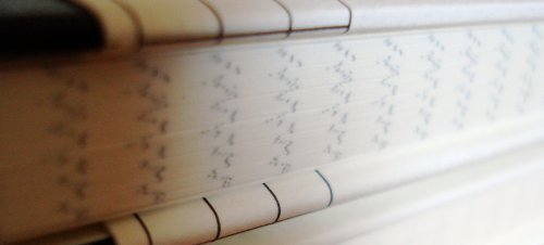
– The page lining imprint is remarkably different. Though the same pattern, The Canadian version is subtle and faint, while the French version is strong and bold. It’s hard to say if it’s just a difference between print runs.
In either variant, they are nice notebooks. Leuchtturm has other sizes, as well as a lattice or dotted grid format that I’ll show another day. I’ve been using a Graf von Faber-Castell pencil in the Canadian version for a few days, and have encountered no problems.
[Update: December 2, 2009]
I asked Leuchtturm about this, and the ruling differences represent different generations of the product, not regional variations. The light rules are the new format, and are being introduced first in Canada and the US.
My thanks to Leuchtturm for their assistance.
the bold printing on the French version is likely _not_ just a print run issue. the French like their graph-paper style writing paper and they like it bold. i’m told this is the kind of paper they use in French schools so they tend to use the same thereafter. almost all paper printed in France is the same: 5×5 quad paper in fairly bold blue ink. it’s often tricky to find the “ruled” style paper that is the norm in Canada and the US.
Thank you for that detailled review and the nice photos! I have recently acquired a Leuchtturm 1917 notebook myself and I can also highly recommend them.
Two questions:
(1) I have not seen them in Toronto. Where did you buy them?
(2) Can you describe the binding? It’s usually what makes me pay $15 over $1.50 for a notebook.
Teefish, thanks for that insight. Pondering this subject, the looseleaf Clairefontaine paper I’ve seen does have the darkest rules I’ve seen.
Gunther, thank you for the compliment.
Razorgoto, it was purchased in Waterloo. The distributor is the well known Kikkerland, so I expect this product will soon be available from many sources.
There are six sewn signatures of 32 pages (8 pieces of paper, unfolded.) The sewing is “tight”, so that the journal does not open as flatly as I might like, but it’s been fine in practice. The leaflet says it is “thread-bound”. Looking closely, there appear to be eight barely visible stitches between each page.
An index! What a brilliant idea!
I can confirm that these are lovely notebooks. In August of this year, Leuchtturm notebooks were all produced with “Ink Proof” paper which resists ink bleed through. The index and numbered pages really set this line of journals apart from the glut of journals on the market. The feedback I have gotten from Leuchtturm users has been very positive. The build and materials are of excellent quality and the prices are generally below those of the Moleskine journals. You should consider trying one if you have been disappointed with the paper in the Moleskine notebooks or if you are looking for a high quality notebook with a reasonable price.
Thanks for the article and great comments!
Cynthia, that was exactly the information I was looking for. I’ve been using Moleskines for years, but finally want something with better quality paper. Some of my inks just bleed too much.
Phidon Pens in Galt (Cambridge) Ontario, is another Canadian source for these excellent notebooks. Mano (owner along with husband Baldeep – really wonderful people -) introduced introduced me to this line of notebooks just this week. (I try to get into the store when I am in the area and when not I order by phone and have them ship.) I was going to buy some more Moleskine but the generous page size and quantity as well as the no-bleed one me over. I can’t wait to finish my current Moleskine notebook to try out the new doted notebook. I can see this as being a real keeper because the dots give me a line to follow for journal writing but a nicer surface for doodling than ruled as I inevitably doodle as well as write.
The Leuchtturm’s I bought all came with the sticky notes. The detachable pages are only 8, as you mentioned. I also bought the very large *Master* 100 gsm in a nice red cover for sketching. I am curious to find out how it compares with the Moleskine Folio 160 gsm.
In-store I saw both 80 gsm & 100 gsm Leuchtturm notebooks with sample inks and nib sizes applied, including large *wet* lines – no bleed at all.
At any rate, I have bought from Mano & Baldeep for roughly three years now. They are wonderful people to deal with. Ordering by phone or email & having items shipped to the city I live in has always been a smooth experience.
Owen, thanks for sharing your findings.
I live relatively near to Galt, and have also enjoyed the great service that Phidon Pens offers. I love the whole store, but especially the Epica shelf – they are incredibly beautiful journals.
There are three excellent art galleries in walking distance from Phidon, so I love to visit the galleries, have lunch, and wind up the trip with a visit to Phidon.
Coming in two years after Razorgoto posted the question these notebooks are probably everywhere now, but I still want to chip in: Midoco on Bloor and Bathurst carries them, along with several other art/stationery stores.
I remember this location carries Leuchtturm quite clearly because of something silly of me: I didn’t know of this brand before going to the store. A student-looking person picked one of these up, I glanced at the label, caught only the first 4 letters and extrapolated it. ‘lecturenotes,’ i thought to myself, ‘why would anyone call their product lecturenotes?!’ The association from the buyer to lectures didn’t help catching the mistake. Anyway, that’s where I first spotted this brand.
i’ve been looking for these notebooks for a long time. Where exactly did you find them in waterloo?
After filling close to twenty journals from various makers with fountain pen writings, I came across the Leuchtturm1917 and purchased it online. I think it is great. the only complaint is the lines are so light they are of limited usefulness. I have realized sometimes that I have drifted away from the lines. Perhaps older writers, who also need more light to read, would benefit from lines that were 10 or 20 per cent darker.