Being quite a pencil aficionado (a.k.a. leadhead) myself, I really looked forward to trying this pencil. I had read quite a few blog entries about how excellent it was. Alas, getting some in Canada was quite a chore. Initial email to Cal Cedar went unanswered, but I didn’t give up and tried their Ebay webform, which provided the necessary contact.
For me, there was a big surprise about these pencils, whose plastic box uses the phrase “American ingenuity” and whose name and marketing invoke the name of California. I had also read about international pencil dumping issues on the excellent Timbelines blog. The surprise for me was that they don’t say “Made in U.S.A.” or any other country of origin on the pencil. Some further web browsing indicated that the pencils are made in Japan. But the phrase “Pan-Pacific ingenuity” may not read as well.
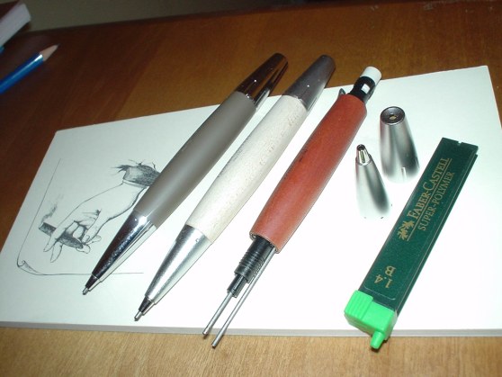
They are packaged in a clear plastic box. I think Cal Cedar should consider either a tin or wooden box as an option. There were dozens of Faber-Castell centennial tins at a local store a few weeks ago – they are all gone now (late January), and I have no idea who around here (other than me) spends so much on pencils – but many people clearly do.
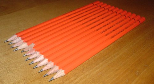
The pencils were coated in graphite dust when I took them out of the plastic. I’ve never seen that before, even with the cheapest pencils, though it was a minor issue. Unpackaged, the first thing I noticed is how the web photos I’d seen hadn’t conveyed the colour, which isn’t exactly red – more a light reddish orange, though not dark like a “blood orange”. The finish is nicely lacquered, richer than most pencils and similar to a Staedtler Mars Lumograph (though I fear the new Staedtlers with the silver markings already represent a diminution of their previous outstanding level of quality).
As a writing implement, I think I finally found the source of the praise – it’s the lead! While different manufacturers may have different grade interpretations, the Palomino is degrees darker – at the same level of hardness. By this I mean an HB seems like a typical 3B, but isn’t as soft and doesn’t need the constant sharpening of a 3B. The only downside I can think of is that some may find these pencils too dark in comparison to their expectations of pencils at specific grades.
I tried side by side comparisons with other pencils, and the Palomino HB is easily the darkest. It’s probably as dark as a 2B or 3B Staedtler. It’s also a smooth writer, and the lead is strong, so overall, it’s an excellent pencil.

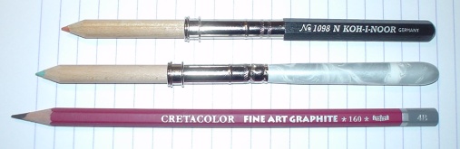
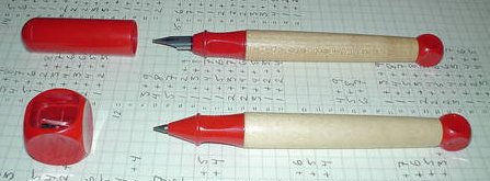
 The pencil is comfortable and writes very nicely. The lead is solid and doesn’t break. Though they ship with an HB lead by default, the pencils also take other hardnesses as well as colour leads from art supply stores.