Gripsharp pencil sharpener

Gripsharp pencil sharpener

New pencil accessories aren’t introduced too often, so I was quite intrigued to learn about the Gripsharp.

It resembles one of those rubber ‘ergonomic’ grips that some people prefer for gripping thin writing instruments.

You put the pencil in, start sharpening, and leave the Gripsharp in place. Put another way, you sharpen away the wood, leaving the exposed pencil core protruding from the device.

Gripsharp pencil sharpener

It does actually write.

Gripsharp pencil sharpener

Here is a photo showing what you are actually doing to the pencil:

Gripsharp pencil sharpener

Unusual as it is, I’m wondering – what is it for? What is the problem it solves?

Would you buy one? What do you think of it?

See some other reviews at:

Office Supply Geek

Lung Sketching Scrolls

I’d like to thank Gripsharp for sending this sample to me.

Moleskine Project Planner

Moleskine Project Planner

Talk about long accordion folds of paper! The Moleskine Project Planner is essentially a long zig-zag folded piece of paper inside the familiar Moleskine exterior – black cover, elastic band, pocket inside the back cover.

I would say it is very unusual, presenting a linear unbroken view of the calendar year.

Moleskine Project Planner

There are some problems, and I’m not sure how to make best use of it. Each day’s numeral has eleven rectangles below it – each of which is 6mm (horizontal) by 10mm (vertical). This isn’t enough space to write anything – maybe just a single character or a check mark. Presumably you would need a pre-existing colour or notation scheme to chart or record something.

Moleskine Project Planner

The reverse side does have an alternate calendar view with a 3.5mm ruled line that could take very small writing.

Moleskine Project Planner

The reverse also has various “helpful” items such as international holidays. There is an error in the Canadian listing, which undermines my confidence in the other presented information.

Moleskine Project Planner

Even if it is called a “project planner”, I can see the format being quite good for tracking personal information such as a budget or diet.

It has also made me think about this paper format – I’m wondering about where one could buy accordion folded thick paper. Moleskine’s Japanese Album is another product that I’ve always thought of as a sketchbook, and now realize could be quite useful for project planning.

The product is just somehow pleasantly clever.

Moleskine Project Planner

An interesting coincidence

First, happy Thanksgiving to pencil talk readers in the United States!

The last two posts were about Faber-Castell pencils. I was doing some further research and came across a recent article in the New York Post: The pencil count.

Apart from being a very unusual interview with Count Anton Wolfgang von Faber-Castell, e.g., “Call me Tony Costello”, I noticed this statement:

He says it helps differentiate Faber-Castell from its competitors, much the same way a car company will manufacture and sell a handful of high-end sports cars while mass-producing a family coupe.

Hmm, here at pencil talk, we wrote in a post on June, 2008 regarding the perfect pencil:

This product started the line, and I think, was very important to the pencil industry, much in the way high end sports cars can stimulate overall car sales, though they themselves may sell in very small quantities.

Car industry metaphors, similes, and analogies are no doubt common today. We’d love to think the Count has read or been influenced by this blog, but that’s probably not the case.

Graf von Faber-Castell Guilloche pencils

Graf von Faber-Castell Guilloche pencils

There were some queries about a particular pencil shown in the previous post. That pencil of interest is the Graf von Faber-Castell Guilloche pencil.

Recently introduced, it is a round pencil with a diameter of about 8.15mm, with a very intricate finish.

Graf von Faber-Castell Guilloche pencils

It is presented in a modest but pleasing cardboard box:

Graf von Faber-Castell Guilloche pencils

For those seeking the pencils, they are formally (at least in English) called “superfine pencils with guilloche finish”, and the model numbers are “11 86 21” for the brown, and “11 86 20” for the black.

Graf von Faber-Castell Guilloche pencils

I find them to have a very pleasing and subtle sophistication. My only complaint is that the factory sharpening shows an unpleasant rough scraping of the wood. Although that’s very common with modern pencils, the original ribbed, silver-capped Graf von Faber-Castell pencils don’t have this problem, and these newer pencils in the same line shouldn’t either.

Graf von Faber-Castell Guilloche pencils

The caps display a crest and crown.

Graf von Faber-Castell Guilloche pencils

The official product page is here.

See also:

Pencil Boxes (II) – Graf von Faber-Castell (pencil talk – February, 2008)

Graf von Faber-Castell pencils. (pencil talk – July, 2006)

Faber-Castell – 21st century pencil manufacturer

The pencils of Faber-Castell

This is almost an accidental post. While arranging some office supplies, I noticed that I had accumulated a few of Faber-Castell’s “special” pencils – their design series pencils, the Graf von Faber-Castell pencils, and “perfect pencil” refills.

Individually, they are all nice, but together they display an amazing array of achievement in modern pencil manufacturing.

The pencils of Faber-Castell

Today’s best pencil or best manufacturer may be debatable – but on the design front – I don’t think there is a competitor.

The pencils of Faber-Castell

I respect the utilitarian history of the pencil. And these pencils are highly usable – well made, solid, possessing excellent grips, and having good quality leads.

Yet they don’t exactly scream ‘utilitarian’. They stand out because of their wonderful design and the clear commitment to create something exceptional in an era when using handheld writing instruments is a choice.

The pencils of Faber-Castell

The textures and surfaces amaze and delight.

The pencils of Faber-Castell

Approaching their 249th anniversary, Faber-Castell seems to be full of innovation.

The pencils of Faber-Castell

What pencil could celebrate their 250th anniversary?

The pencils of Faber-Castell

Leuchtturm 1917 notebooks

Leuchtturm 1917 notebooks

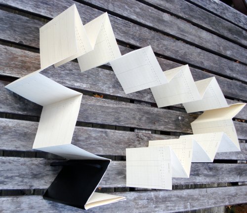
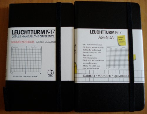
Here are two Leuchtturm notebooks. One sourced in Canada, one in France.

Leuchtturm 1917 notebooks

Leuchtturm (meaning “lighthouse”) is a German philately and numismatic supply company founded in 1917. Among their offerings are specialty supplies for collectors – a particular item I find very intriguing is an album for collecting the metal capsules that crown Champagne corks! Who knew? And who retains that sort of collecting determination after downing a bottle of Champagne?

Leuchtturm 1917 notebooks

These are pocket sized notebooks with hard covers. They have an elastic enclosure band, a page marker ribbon, and a pocket inside the back cover.

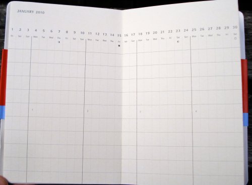
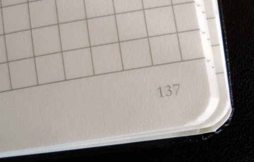
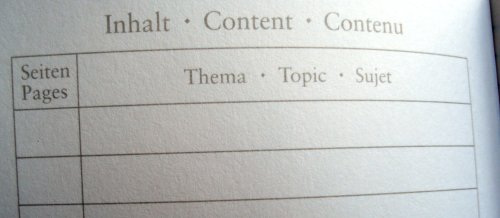
They also have a feature that I love – numbered pages and a blank index section! This is a great solution to the problem of finding what one has written down. Plus, the numbers look like they belong, using the same font and ink colour as the rest of the text. There are laboratory and accounting notebooks with this feature, but many that I’ve seen appear as if they were stamped via a separate and unrelated printing process.

Leuchtturm 1917 notebooks

Leuchtturm 1917 notebooks

So congratulations, Leuchtturm. Page numbering is one of those little things which makes all the difference. For me, it’s a great benefit because I do write down things that I want to quickly retrieve later.

Here’s what I’m puzzling about. My two notebooks have a number of differences:

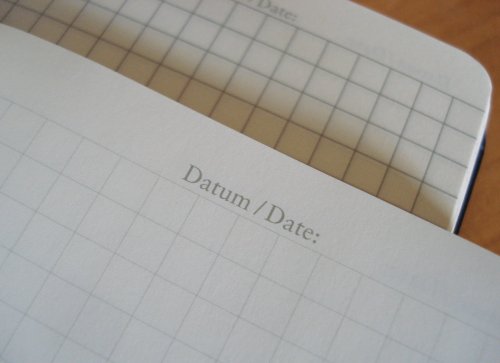
– Both are 90x150mm, but the Canadian one has 185 pages, while the French one has 187 pages. The interiors are physically the same, but the arrangement of blank pages around the index varies.

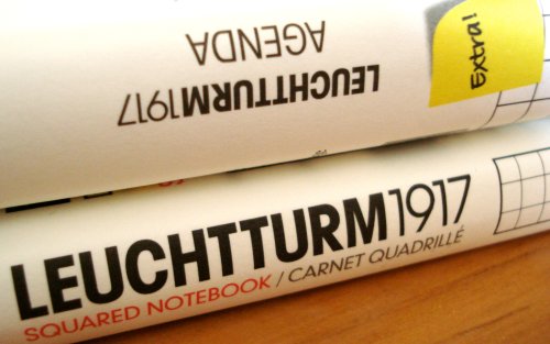
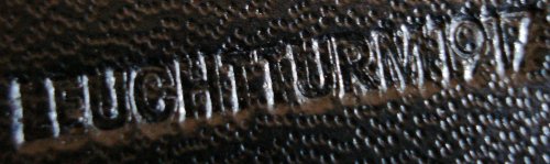
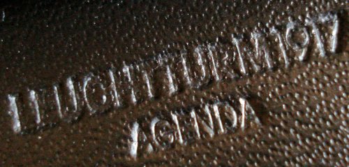
– The French version is stamped Leuchtturm 1917 Agenda, while the Canadian version is simply “Leuchtturm 1917”.

Leuchtturm 1917 notebooks

Leuchtturm 1917 notebooks

– The last eight pages of the Canadian version are detachable (starting at page 171), while 32 pages of the French version are detachable (starting at page 125).

– The French version came with 60 sticky notes on a card that fits nicely in the back pocket. The card’s back side has a ruler, and some unit conversion tables – a nice touch.

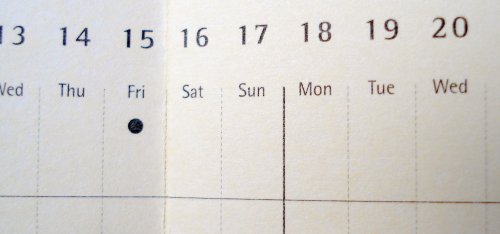
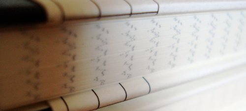
– The page lining imprint is remarkably different. Though the same pattern, The Canadian version is subtle and faint, while the French version is strong and bold. It’s hard to say if it’s just a difference between print runs.

Leuchtturm 1917 notebooks

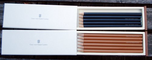
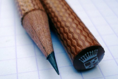
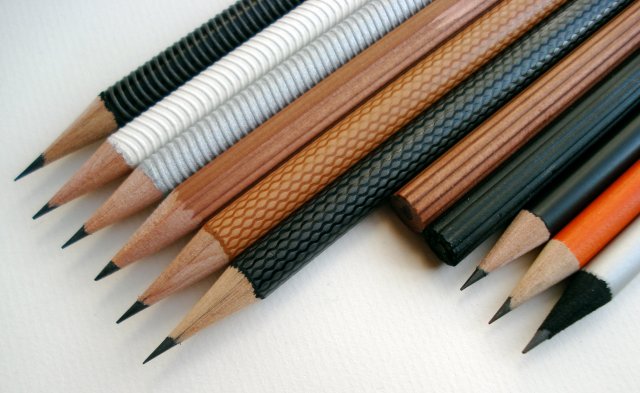
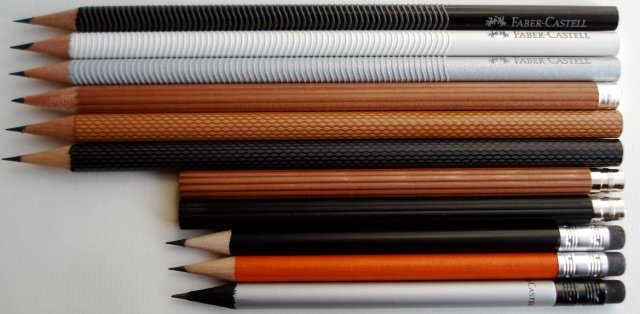
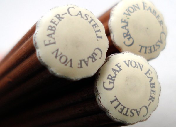
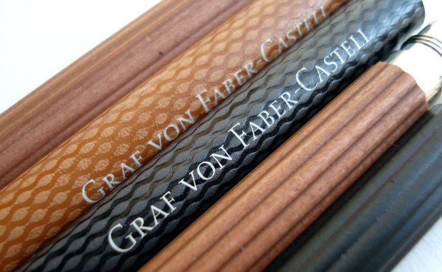
In either variant, they are nice notebooks. Leuchtturm has other sizes, as well as a lattice or dotted grid format that I’ll show another day. I’ve been using a Graf von Faber-Castell pencil in the Canadian version for a few days, and have encountered no problems.

[Update: December 2, 2009]
I asked Leuchtturm about this, and the ruling differences represent different generations of the product, not regional variations. The light rules are the new format, and are being introduced first in Canada and the US.

My thanks to Leuchtturm for their assistance.