LAMY woodcase pencils

Some major news – LAMY, a company renowned for the advanced industrial design of their fountain pens and mechanical pencils – have released a line of woodcase pencils.

Please enjoy the first views at Lexikaliker.

Let’s hope LAMY will offer wide distribution.

On the cloud

This blog is now coming to you from – somewhere, aka the cloud.

I hope it is faster. There may be a couple of things that don’t yet work.

Pencil displays – showcasing your pencils

Collectors and accumulators of woodcase pencils have long looked for display options, and the choices are few. As well as offering a collection of 500 colour pencils, Felissimo is a rare vendor of display cases for pencils. Today we’ll look at their “Aurora” and “Flower Vase” models.

I am sure that some craftsperson out there could also come up with something! There are a lot of low cost cases and displays for fountain pens out there – pencils also deserve some attention.

First, the Aurora, which holds 100 pencils between two fitted acrylic sheets. These photos show the assembly stage on a desk, though the display is meant for a wall – probably a white wall to best show the pencils.

The sheets fit together with acrylic nuts and bolts. Probably no explanation is necessary, though an instruction sheet is supplied. Round modern standard sized pencils seem to fit best, and hexagonal and triangular pencils also work. But – no oversize pencils, no pencils with ferrules and erasers, and no square pencils.

I thought the Aurora would be great for displaying some of my favourite novelty pencils. These favourites all seem to come from the UK – Japanese pencils such as the Pantone and Japanese Railway tributes series are in square format.

Well, I think it is taking shape nicely, though 100 turns out to be a large number. I’ve filled only about a third of the case and I’m out of pencils.

Display cases for pencils

The view from the top:
Display cases for pencils

The entire case from the top:
Display cases for pencils

The Flower Vase displays hold 25 pencils each, and are a non-acrylic plastic. It seems to be a pretty good way of keeping a number of pencils tidy:
Display cases for pencils

Display cases for pencils

You can of course use everyday pencils, such as these California Republic Prospectors:
Display cases for pencils

Displaying vintage pencils is of course another possibility. Starting with major manufacturers in Germany and Austria, I was surprised that I couldn’t find that many to display. I may have to rethink this!
Display cases for pencils

Something else to note is that, especially with the vintage pencils, positioning the imprints is key, and not easy to accomplish in a satisfactory way. It is easy to put a pencil in, but if you want to adjust it, hard to remove.

The products are nice though not perfect, and I hope to show some photos when (and if) I figure out what to put in them!

Very tiny pencils

Very tiny pencils. They didn’t survive the post office treatment:

Very tiny pencils

For comparison, with a standard pencil:

Very tiny pencils

They aren’t novelty pencils – they have a 9 to 5 job, filling out customer surveys.

Only about 2mm in diameter, they appear to be constructed like a regular pencil. I’ve never previously seen one.

My thanks to Sean for sending these my way.

doane paper

Doane Paper

A previous post mentioned a successful stationery shopping trip. One of the brands I picked up was “doane paper”. I had definitely heard of these fine folks via The Pen Addict. The Addict uses doane paper in all his reviews. It may be an addiction. The paper’s grid combines traditional lined ruling with squared (graph paper) ruling.

While the doane paper website offers online ordering, the economics of their flat rate shipping to Canada aren’t too appealing to potential customers who just want to try a pad of paper. It may make sense for large orders.

So count me lucky in that I stumbled across one of their few brick and mortar retailers – Laywine’s in Toronto. I picked up packages of the 8.25″x11.75″ and 5″x8″ paper pads and the 3.5″x5.5″ stapled notebook. (1″ = 25.4mm, and I’ll continue to use Imperial measurements here because they turn out to be integral to the product format.)

Doane Paper

The paper immediately struck me as appealing in design, as well as offering a nice heft. What I wasn’t so pleased with were the thin cardboard backing and the bright shiny blue top section. The thin back means the pad can only be used on a desk or other solid surface, and the super glossy blue section struck me as being a distraction.

Doane Paper

While the paper and layout are very nice, there are a lot of elements that are so “just right” that I have to presume they are the results of careful and thoughtful design.

The paper pattern in based on 1/8th inch squares rendered in fine blue ink. The small pad is 36 squares wide and 54 squares long.

Doane Paper

Let’s note two paper design items here:

First, the smaller squares are almost unique. 5mm squares are a stationery norm, from high end Clairefontaine and Rhodia to generic office supply store paper, and the 1/8th inch (about 3.2mm) squares, with fine line rendering, have much more of a precision engineering look and feel.

Second, the squares are contained, and don’t bleed to the edges (see the top two photos). This addresses another problem – quadrille/square/graph paper almost always has the issue of randomness of the application of the ruling pattern. Even Exacompta Record Cards have this issue. (Japanese manufacturers such as Correct seem to have solved the problem, and can consistently apply the square pattern across a given paper format.)

What this means is that is that the grid layout looks more centered and even more precise than almost any other paper most of us typically handle. The doane paper pad appears so precise and exact because it uses smaller squares, and because the squares don’t bleed to the edge.

Next, every third horizontal line is thicker – these are the normal horizontal rules of most paper. The number of vertical squares (54) is of course is divisible by three, so that there are 18 normal ruled sections created by the 17 thick rules.

Doane Paper

The pièce de résistance is the thick red vertical margin rule. Something in me says it should be six squares in to balance the three squares of the thick horizontal rule section in a 2:1 ratio. But of course it shouldn’t be! It is five squares in – for a 5:3 ratio, approximating the golden mean.

The 5×8 pad in particular, which has 50 perforated sheets, with a detached sheet being 5×7.25, really is a compelling offering.

The large pad, which I also like, is 62 squares wide and 84 squares long. The margin line is seven squares in.

Doane Paper

The above stated, I’m neither a designer nor a design critic. I was taken with the paper and wanted to try and learn what elements made it so interesting and special. I hope some or much of the analysis is correct.

Doane Paper

The ‘utility notebook’ was less interesting to me. The cover is very thin, making it unideal as a travel companion. As well, the graph bleeds to the edge and there are no red margin lines – all the elements which seemed most interesting in the pads are absent in the notebook.

Doane Paper

There are other formats as well, but I didn’t see them at Laywine’s.

Now the paper itself seems to handle graphite really well. The sturdy bright white paper and blue lines combine very well with graphite – either ceramic or polymer. A super high quality pencil like the Tombow Mono Mark Sheet just pops on the paper.

Doane Paper

I recently used the small pad to help prepare for a presentation, and I found the format to promote conscious, organized note taking. Speaking to an audience, where content and time management are parallel tasks, was a challenge ably addressed by this format. I said to myself, “Content goes on the lines, timing and technical notes on the grid”. I really didn’t have to think about it – it just worked.

For many readers of this blog, I think doane paper is well worth examining. Have you seen it?

Pencil review: Derwent Graphic

It is a bit of a shock to realize that this website has existed for so many years without offering a single article on a product from this particular manufacturer. With a location near the original Borrowdale graphite mine and the beginnings of the lead pencil industry, as well as offering a broad and internationally distributed line of premium pencils, Derwent is one of today’s top manufacturers.

Derwent was established in Keswick in 1832. This is in the region of the mine where graphite was discovered. (See Petroski’s The Pencil for further information.) The location cannot be random, and it seems reasonable that there is some link back to the original mine.

The company today is owned by global conglomerate ACCO (originally “American Clip Company”), who have wisely left the brand unaltered. The ownership has continued to invest in production as well as support the company history and heritage through the sponsorship of the Cumberland Pencil Museum. Contrast this with how Sanford has treated acquisitions!

Derwent today offers over a dozen full lines of artist oriented pencils, plus many other media and accessories. They have all the traditional media in woodcased pencil form – graphite, wax colour, charcoal, and chalk pastels. Plus they offer all of these in a huge number of format permutations.

In woodcased graphite pencil form, the following are offered:

Graphic – a range of hexagonal pencils in twenty degrees, from 9H to 9B. We’ll look at the HB today.

Sketching – HB, 2B, and 4B round pencils with oversize cores. Very waxy, we’ll look at these another day. I think many people will like them!

Watersoluble Sketching – HB, 4B, and 8B round pencils with oversize water soluble cores. They seem drier than other watersoluble pencils I have tried.

Onyx – a new line, apparently very dark and saturated.

Lakeland Graphite – a student range which I’ve unfortunately never seen.

Cumberland Graphite – a general purpose range.

Rexel Office Pencil – the Derwent website says, “It does the job you expect it to.” Again, I haven’t seen this pencil.

Do you know any of this range? Do you live near the Lake District?

Derwent Graphic pencil

Name: Derwent Graphic.

Full name and model no: Derwent Graphic.

Manufacturer: Cumberland Pencil Company, part of ACCO UK Ltd.

Background: See above.

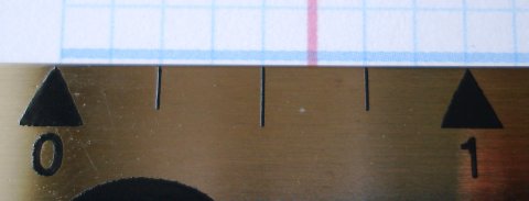
Weight: 3.7g – possibly the lightest modern quality pencil.

Dimensions: Rounded hexagon with finished cap. Standard (~175mm) length.

Derwent Graphic pencil

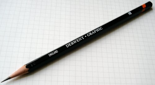
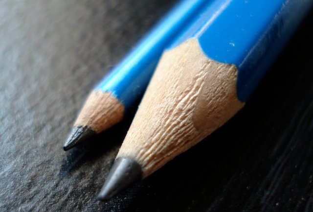
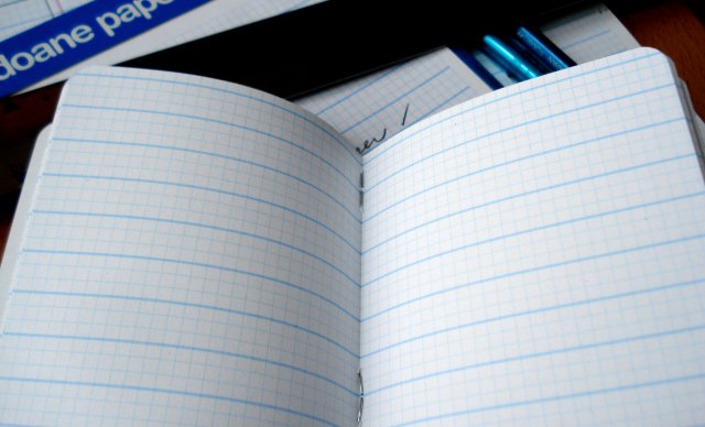
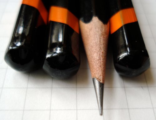
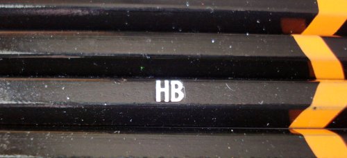
Appearance: The pencils are hexagonal and sharpened. The pencil finish is black, with white imprints and a geometric orange stripe. The lacquer seems very light. The basic black colour scheme may contribute to this appearance. Different pencils purchased at different stores seem to vary, but the lacquering generally seems quite “bargain” rather than “premium” to me. The stinginess with the paint might be an aspect of the pencil’s light weight.

The pencil is marked:

England Derwent Graphic HB

Other notes: The minimal marking on the pencil and absence of a bar code are a nice change of pace.

Grip: It is a fairly standard pencil.

Sharpening: Using cedar (less common in 2010), the pencil offers a superior sharpening experience.

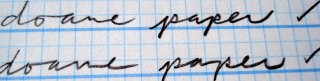
Writing: There are a lot of possible reasons for choosing a pencil. Some criteria, such as reaction to atmospheric humidity – which I do see as a reasonable measure – require either specialized equipment or years of study to detect. I can’t comment on these aspects. But as a smooth writer with dark precise lines, it just doesn’t compare with a pencil like the Mitsubishi Hi-Uni. Against the Castell 9000, it seems possibly better in some ways, and worse in others. So it belongs in the graphite pencil Formula 1 season, but won’t win pole position most days.

Erasure: On Rhodia paper, a Pilot Foam erased very well. A Factis Extra Soft ES20 has a couple of challenges.

Derwent Graphic pencil

Overall: I’m glad that Cumberland and their Derwent brand are thriving. Yet as a potentially top-tier pencil, I find the lead of the Graphic not quite good enough. Industry officials have stated that a pencil’s core may be 10% of the cost and the finish 33% of that cost. The Graphic already has a very modest finish – barely acceptable, in fact. Cumberland should put some of their lacquer/paint savings into the graphite/clay/wax core. Globalization is the challenge, and there are some very good competitors out there.

Weblogs suggest there are a number of UK readers who may know Derwent – what do you think?