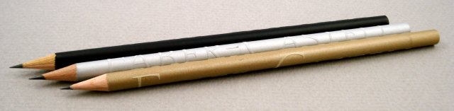
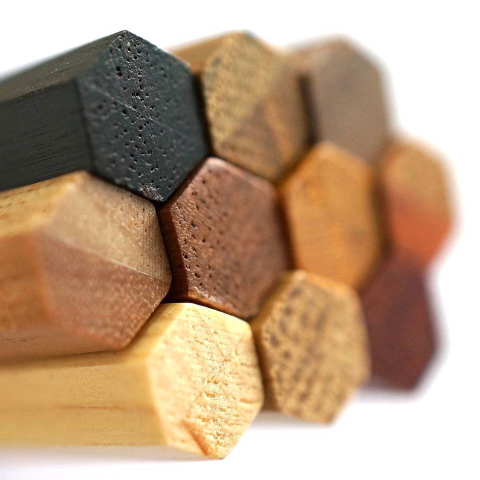
The Faber-Castell 250th anniversary pencils.
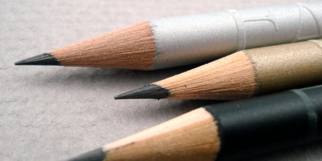
The raised lettering is remarkable.
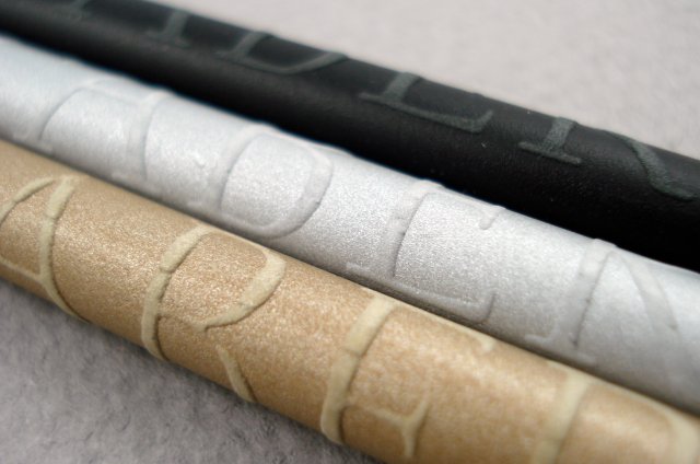
The caps acknowledge the anniversary year.
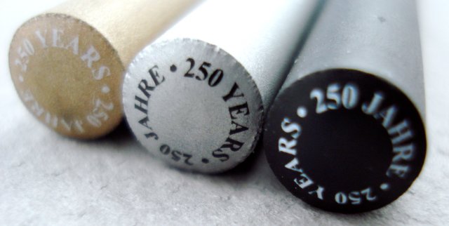
Congratulations to Faber-Castell on their 250th anniversary year!
pencil talk | pencil reviews and discussion
exploring the art and science of pencils since 2005
The Faber-Castell 250th anniversary pencils.
The raised lettering is remarkable.
The caps acknowledge the anniversary year.
Congratulations to Faber-Castell on their 250th anniversary year!
They look gorgeous! Does the paint rub off though?
Claire, my experience with these pencils dates back to yesterday. No wear yet. :-)
Neat! thanks for sharing these pictures. Haven’t seen them in the USA yet.
Fantastic pencils! Is the raised lettering an overlay on top of the wood or is it integral with the wood? The only way it is continuous with the pencil in my mind is if the entire pencil body is under compression except for the lettering. Was the pencil pressed between two rollers with inverse indentations to allow for the raised lettering?
However they did it, I think the effect looks awesome! :-)
These are nice looking pencils – thank you for showing them.
I wouldn’t be suprised if the lettering has been applied by EPD Eckhoff, about 20 km away from Nuremberg. But of course this is just a guess.
Yes they are nice and congratulations to FC for surviving 250 years in a very competitive industry. However a special edition of the FC9000, their flagship pencil, would have been nicer and an acknowledgment of a large percentage of their customer base. I sometimes think Faber Castell have lost sight of their middle ground with red line products and GvFC products seemingly their target areas. Trying to find FC 9000’s other than online is becoming increasingly difficult. Sorry just a rant from a forgotten Faber Castell user.
A agree with Kevin about a FC9000 special edition.
In the part of Europe where I live is quite easy to find FC9000 almost everywhere, much easier than Mars Lumograph, for exemple.
What gradient is this 250-year anniversary pencil? Is it marked somewhere in the pencil?
Is the graphite as good as the FC9000 range?
BTW, does anybody know which gradient are the GvFC pencils?
They look nice indeed. A “must have” for a pencil person. @Joan: The GvFC pencils: I have seen them listed as B grade in some ads, but FC grading is a bit on the light side – IMHO they would equal a H – but a smooth one.
regards Henrik
I wonder if the F-C USA headquarters will eventually stock these.
Thanks for the pictures! It reminds me that your site has been the sole source of information for many (actually, most) of the pencils I now know about, and without Pencil Talk, I wouldn’t have otherwise have come across them at all. It would be nice if companies such as Faber-Castell understood that, despite their tremendous economic reach, the magical and passionate aspects of “writing culture” are preserved and continue to flourish in the digital age mainly due to blogs such as Pencil Talk, Lexikaliker, Bleistift, Pencil Revolution, and others.
Thanks for all your hard work!
All, thank you for the comments.
Boris and Gunther, the Faber-Castell corporate gift catalog shows similarly manufactured pencils with raised lettering. I have no idea how it is achieved. The concept seems related to the raised dots of the Grip 2001 pencils.
Kevin, I agree, a commemorative product accessible to more of their users would be welcome. I have to say that I thought I was lucky in finding this pencil locally – a lot of their products don’t cross the Atlantic.
Joan, there are no other markings on the pencil, apart from a bar code that was on an attached sticker. I believe it is the same pencil as the recent F-C design pencils.
Henrik, thank you for the comment.
Sean, thank you for the kind words, and for your many contributions.
Claire, I think the raised lettering on these pencils are made of the same material that the soft-grip zone “dots” or “bumps”, as they called them, on their Faber-Castell Grip 2001; I write this based on the wonderful pictures that pencil talk offer us here (as we are used to).
I agree with penciladmin when you said “The concept seems related to the raised dots of the Grip 2001 pencils”, but I go even further since I don´t have these beauties, I think they look same “texture”, than dots or bumps, so in these order of ideas this could happen with this finish: https://www.penciltalk.org/2010/07/summer-takes-a-toll
penciladmin, what about the packaging, chusion pack or metal tin, or none?
I agree with Kevin and Joan, I miss an anniversary Castell edition. Maybe Faber-Castell wants to get all that they can from the Grip 2001, after all they spend time and money in R&D to offer a “new” product in this range where innovation is difficult but no impossible.
The big problem with Faber-Castell is their rather aloof marketing, meaning unless you visit high class retail estalishments these sort of offerings become almost impossible to find. It becomes almost like a game – the harder something is to find the more the perceived value.
Excellent !
What’s the cost? (@ stores not online)
Wow. And I thought I loved pencils!
These are too beautiful to use, and your photos are outstanding.
I like knowing there’s a site like this.