Prismacolor Turquoise Pencil

Cap of the Prismacolor Turquoise pencil.

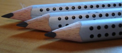
Here’s a modern pencil with a unique retro look and quite a bit of history. The Eagle Turquoise dates from at least 1901 (according to the Berol UK website) and is mentioned in Petroski’s The Pencil. It was made by Eagle (which became Berol), and eventually acquired by Sanford.

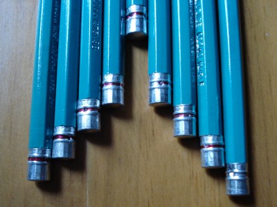
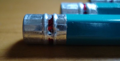
The pencil is turquoise (did I have to state that?) with silver stamping, and has a noticeable metal cap. It’s not a common feature. The cap has a faint red stripe.

It is imprinted:

USA ‘Chemi-Sealed’ Prismacolor Turquoise 02263 (375) 2B

The five digit number varies with the pencil grade.

It’s a good pencil, and does indeed seem quite strong. It writes smoothly and darkly without the graphite crumbling – no complaints.

The box (a typical art supply tin) has this description:

“The long-standing tradition of Turquoise professional drawing pencils continues to set the industry standard for the highest quality in technical and fine art drawing. Pure and smooth laydown in a wide variety of grades, the lead sharpens to a perfect point for a scartchless, glossy line in any weight.”

The “Prismacolor” branding is much more emphasized than the “Turquoise” name.

I happen to have a couple of older boxes of Turquoise pencils from the Berol and Eagle eras, shown below.
Boxes of Vintage Turquoise pencil.

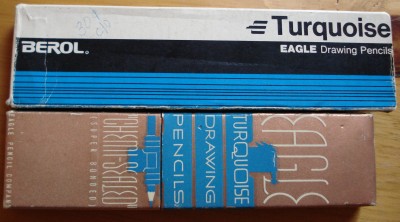
The newer box says, “Turquiose Eagle Drawing Pencils with strong, smooth durable leads precision graded in 17 degrees.”

The older box is more verbose:

“Stronger points…Developed by seven years of intensive research, the super-bonding process (U.S. Patent Nos. 1,854,905 and 1,892,508) welds the Turquoise lead and wood into a solid unit that effectively resists point breakage.

“Exact grading…Scientific proportioning of graphite and clay in 17 different lead formulas akes every Turquoise true-to-grade. The super bonding process prevents any change in this basic perfection and guarantees lasting uniformity.

“Smoother leads..The correct content of rare lubricating waxes is permanently retained in the leads by the impervious coating deposited on them in the super bonding process.”

Wow! Would it be possible to market a pencil in this manner today? I love all the references to science and research.

The older pencils actually have the patent numbers printed on the pencils!

The Turquoise is a winner – a reasonably priced high quality modern pencil, with some design flair and a century of history. What’s not to like?

Caps of the Prismacolor Turquoise pencil.

Faber-Castell Jumbo Grip Pencil

Faber-Castell Jumbo Grip Pencil
Following the immense success of the fantastic Grip 2001 pencil, Faber-Castell extended the line with erasers, sharpeners, colour pencils, mechanical pencils, and this, an oversize pencil.

Marketed as being easy to grip, and useful for children learning to write, both the pencil and the lead core of the Jumbo grip are oversize. Unlike the Grip 2001, the cap is unfinished, and the pencil has a reserved place to write one’s name. While the colour scheme is the same as the 2001, the dots are raised much less, the paint seems much thinner, and is more matte than glossy.

Faber-Castell Jumbo Grip Pencil

I found it a little bit awkward to use. It may just be that I’m not generally using oversize triangular pencils.

It’s also noticeably not the calibre of finish that the original Grip has. This is quite disappointing, as these are sold at a high price point.

The lead is visibly different (lighter) than that of the original, and perhaps a tad less smooth.

Overall, it seems like Faber-Castell made a derivative knock-off of their own high end product.

Faber-Castell Aluminum Perfect Pencil line extended with black + silver pencils.

Silver paint perfect pencil.

Faber-Castell has introduced a silver and black extension to their Aluminum Perfect Pencil.

The Perfect Pencil line is a series of pencil extenders that serve as stylish point protectors, and feature clips and built-in sharpeners. Higher end models in sterling silver, stainless steel, and white gold rank with fine fountain pens as luxury writing implements. The Aluminum variant is above the low-end plastic version, and below the precious metal versions in the lineup.

Silver paint perfect pencil.

The new pencil is in a sleek silver paint with black dyed wood, black ferrule, and black eraser. This perfectly matches the aluminum of the cap. It is a very nice looking pencil, on par with the Design pencil or offerings from Nava. It gets noticed, while also being a first rate pencil.

The pencil is not a commodity – Economist article on Faber-Castell

It just came to my attention that the March 3rd Economist “Face Value” column had a full-page article on Count Anton Wolfgang von Faber-Castell and the Faber-Castell business. It’s a good read for anyone interested in the pencil business.

A few quick facts:

* F-C annual revenue is $US530M

* The Count owns 88% of the firm

* production is 2 billion pencils/year

* the debt to equity ratio is 50%

* there are sixteen manufacturing plants

* the expected growth market is in drawing as a hobby

On a personal note, happy Easter to those who are celebrating the holiday.

Faber-Castell Design Pencil


Faber-Castell has released a “Design Pencil” that is indeed the embodiment of design.

It is a fantastically good looking black triangular pencil, with black dyed wood. Like it’s elder cousin, the Grip 2001, it has raised dots on the side, though here they are smaller and beneath the surface paint. Markings are thankfully kept to a minimum, with only “Faber-Castell” and a small logo written on one side in grey.

In a B grade, it is very pleasant to hold and use. The lead is very strong and non-crumbling.

While I like Nava‘s pencils for appearance, this new creation has again demonstrated Faber-Castell’s industry leadership and ability to keep taking pencil design and presentation to higher levels.

Kita-Boshi HIT No. 9900 pencil

Kita Boshi PencilsWhile Mitsubishi, Tombow, and Pentel may be better known in the west, there is at least one more quality Japanese pencil manufacturer of note: Kita Boshi.

The Japanese pencil industry website tells me of many other companies in the industry, but Kita-Boshi are the only one of these whose products I have been able to source.

I am not sure what is going on, because two different grades of the HIT No. 9900 appear to be different pencils, despite the same name and model number.

The 4B is round with an unfinished cap, and black with gold stamping. There is a gold band near the cap. It has these markings:

Obverse: Kita-Boshi HIT [8 Japanese Characters] 4B
Reverse: For Draftmen, Designers, Copy-writers No. 9900 4B

The HB is hexagonal, with colourings I have never seen in a pencil: Brown with gold stamping, and a green band near the cap.

It is marked:

Obverse: Highest Quality * KITABOSHI * HIT * HB
Reverse: For Retouching & Special Drawing No. 9900 HB

Another difference: The 4B core is approximately 50% wider than the HB core.

I can imagine the sincere but slightly awkward slogan “For Draftmen, Designers, Copy-writers” being enjoyed by many, though less so by Draftsmen and Draftswomen.

Both pencils, like the Pentel, have matte rather than glossy finishes. This is fine with me, and is quite pleasing. It is a quality finish, while being quite practical.

Both pencils sharpen easily, and lay down rich smooth dark lines. The 4B is almost unique as far as I know in being a round pencil at that grade. Its wide core, good looks, and quality graphite would truly make it a “hit” if it was more widely available.

The HB is very good in its category. The standards of Japanese woodcase pencils are very high, and this pencil doesn’t disappoint. It looks good, writes well, and while not as rich as the Mono 100 or Hi-Uni, still lays down a line better than most pencils.